Dashboard + Mobile App
Shamir Optics
Shamir Optics is a company that specializes in the design and
manufacturing of ophthalmic lenses
Dashboard + Mobile App
Shamir Optics
Shamir Optics is a company that specializes in the design and manufacturing of ophthalmic lenses
Overview
In this project I will present some of Shamir Optics products I worked on during 2023.
Shamir Spark is a sophisticated electro-optic system for eyewear measurements using selfie-like experience. This cutting-edge technology presents a new learning curve for optometrists to use the technology while adapting the use of the app in real-time.
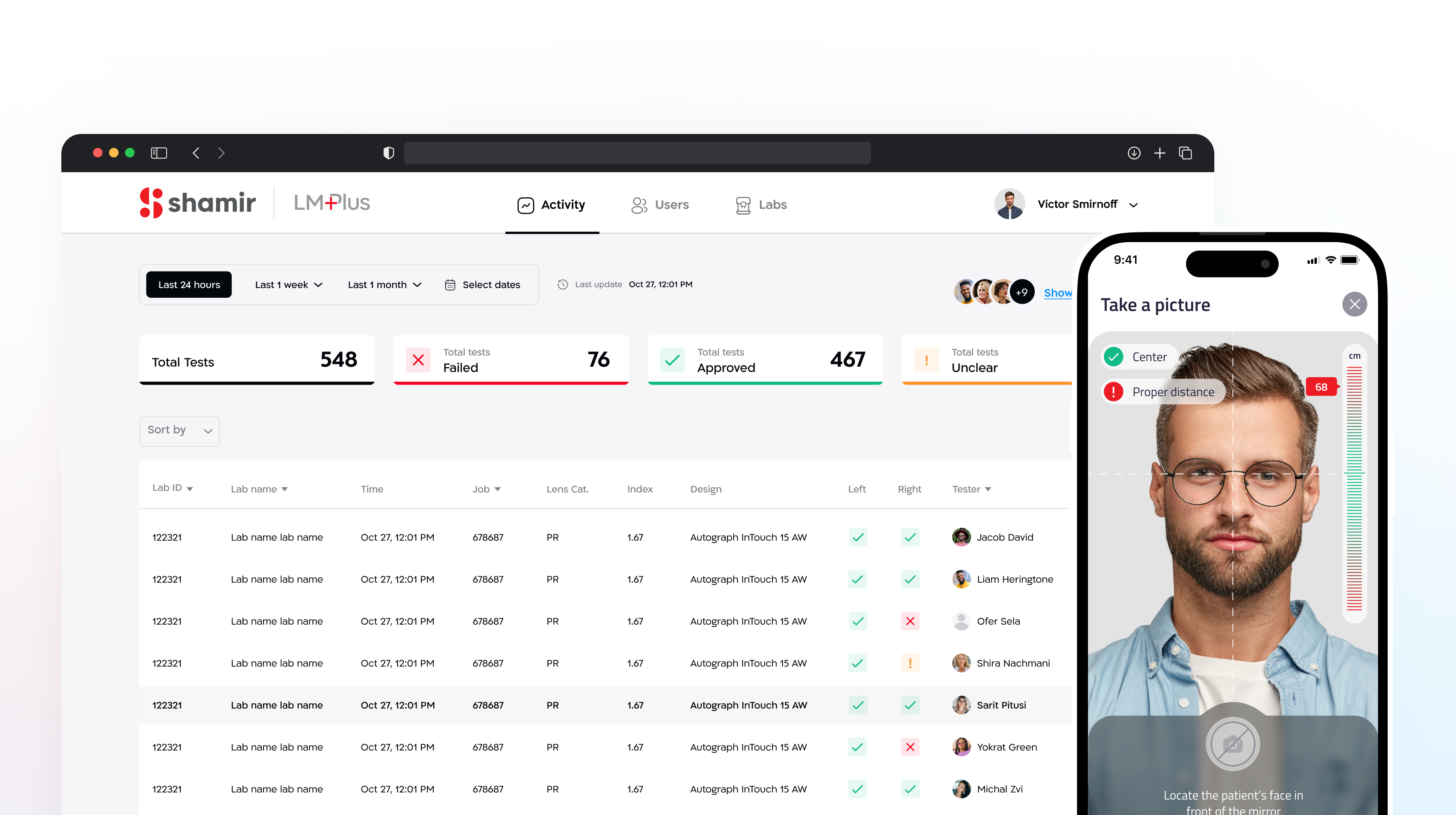
A parallel project would be the design of a dashboard system tailored for optometrists and managers. This platform enables them to efficiently oversee and manage shifts, enhancing operational effectiveness.
This would be a project collaborating with a UX designer while handling branding decisions, accessibility issues, creating a comfortable working environment and addressing various other aspects to ensure a seamless user experience.
My Role
UX Research, Visual Concept, Dev Handoff
Team
Moti Sarig, UX
Timeline
Jan 2023 – May 2023
Highlights
Supporting innovative technology of digital facial measuring
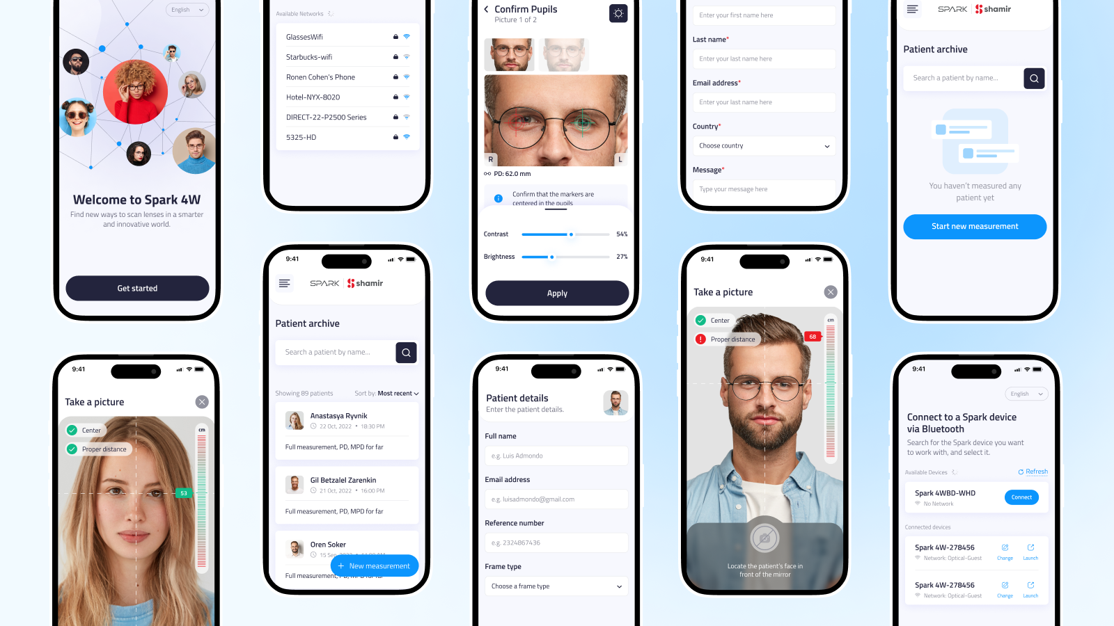

0.1 “Spark” app screens showcase

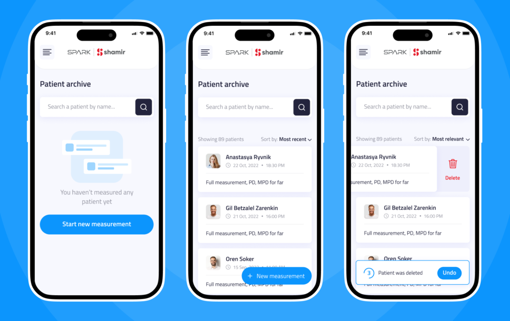
0.2 Patient list management
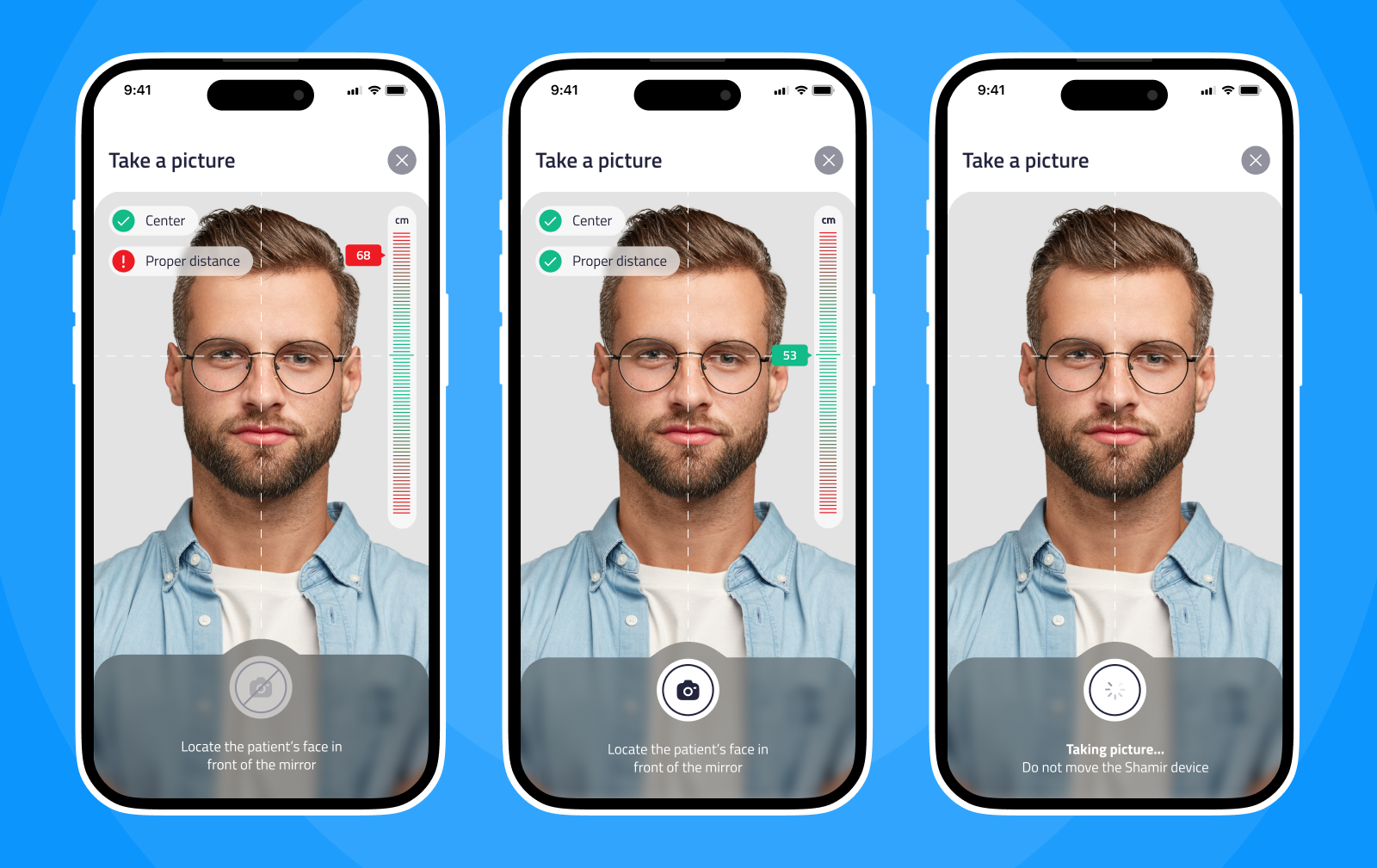
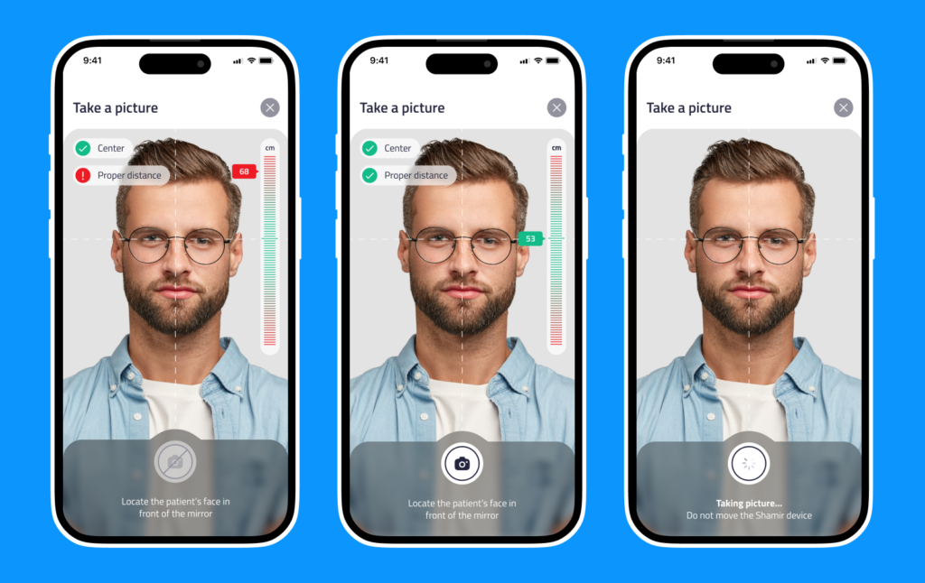
0.3 Measurement of the patient’s face
0.4 Shamir dashboard login page
0.5 Shamir Spark app Splash page
Context
Enhancing Optometry Practice
Introducing Seamless Tech Integration
This project wasn’t just about our users mastering a new piece of technology, it was also about embracing a paradigm shift in optometry—one that prioritizes precision, accessibility, and user-centric design.
As we delve deeper into the app’s functionalities, we realized its potential to enhance not only the optometrists’ practice but also the overall patient experience.

1.0 Screenshot from Shamir’s website illustrating the process
Problem Statement
User adoption and ergonomic interactions
Onboarding resistance
The initial flow of the app was based on granting access to sensitive pieces of information like location and Bluetooth functionalities.
Intuitive interaction design
The app’s functionality needed to accommodate the gentle movements required by optometrists as they positioned their hands on the screen to locate the eye pupil in patient selfie pictures. Designing for this delicate interaction was essential for user comfort and accuracy during eye examinations.

1.1 Old desktop version of the picture snapping screen
User Journey
Navigating the journey to innovation
Focusing on connectivity
We focused on the user journey within the onboarding flow, particularly on the process of connecting Bluetooth, location services, and other essential functionalities. Recognizing the sensitivity of this flow, we dedicated significant attention to ensuring a seamless and user-friendly experience.
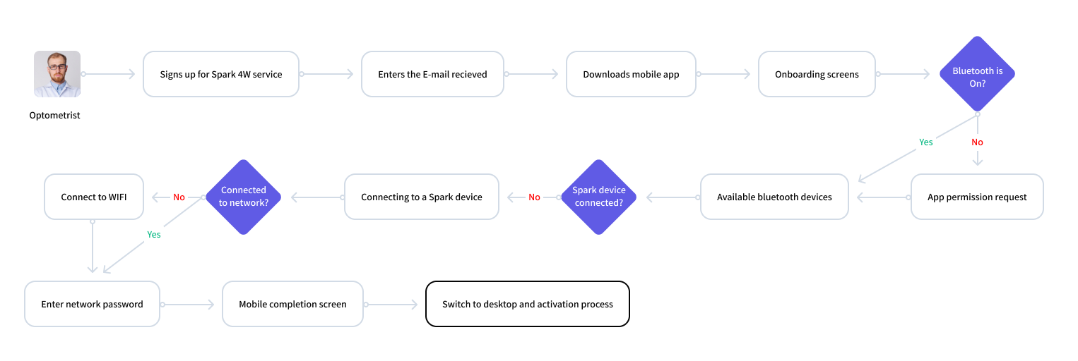
1.2 User journey
Onboarding
Can I get your permission?
App permissions requests
Researching best practices approaches for app permissions requests led us to understand the most effective methods for communicating the necessity of permissions and addressing user concerns.
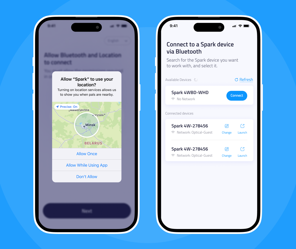
Content: Clear explanations
We communicated to the user why we were asking for this permission.
Timing: Permission in context
We looked for users’ consent only before performing actions that may affect their experience.
Overlay: Choosing the right one
Although most interruptive, We chose dialogs because of their use to facilitate immediate action-taking.
I chose to use the default system dialog box to enhance reliability and prevent the perception of intrusion by an external source.
1.3 Familiar patterns from the worlds of permissions
Delicate Interaction
Zooming for pinpoint precision
Smooth, accurate movements
During eye examination of a patient, the optometrists encounter the challenge of precisely placing the target sign on the patient’s pupil.
Recognizing that the user’s finger may cover the target spot, we took inspiration from the worlds of image and video editing.
As a solution, we implemented a window that zooms in on the eye area. This feature enables optometrists to discern the exact location of their finger relative to the pupil, ensuring accurate placement of the target sign.
Insight
Innovative patterns and best practices in other fields will help create an interface that not only meet user expectations but also delight and inspire users, ultimately enhancing their overall experience and satisfaction.
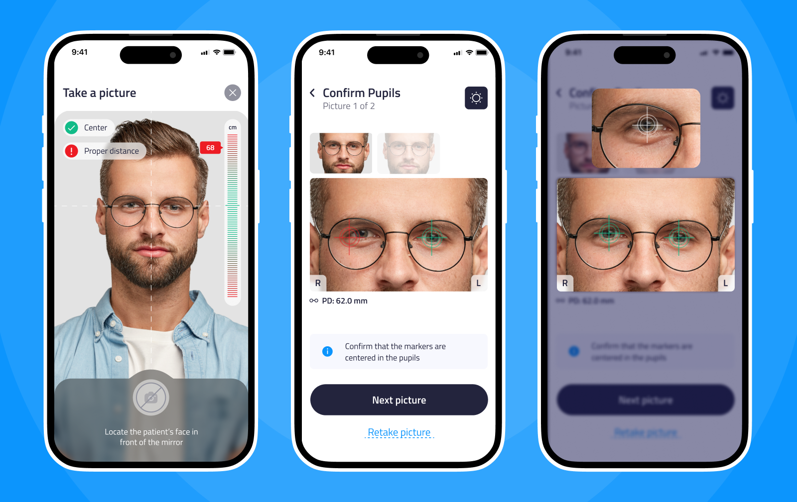
1.4 Showcase of patient’s face measurement
Design framework
Analyzing the brand’s identity: Problems and takes
Human faces as a design key feature
As I was analyzing the brand through its brandbook, I noticed the presence of authentic imagery featuring real people and faces. I felt the impact it had of evoking genuine emotions and connections.
2.0 Login Page
Shamir’s original color palette was quit unsuitable for the digital world, lacking the necessary accessibility and contrast required. So, I had to make significant adjustments to make it valid for good user experience.
Shamir’s color palette: Problems
- Red as a primary color
- Colors not accessible
- Not enough contrast between the colors
- Color clashes create visual discomfort
- Fade-out, weak shades next to highly saturated main color

2.1 Shamir’s brand color palette taken from the brandbook
Shamir’s original color palette was quit unsuitable for the digital world, lacking the necessary accessibility and contrast required. So, I had to make significant adjustments to make it valid for good user experience.
Shamir’s color palette: Problems
- Red as a primary color
- Colors not accessible
- Not enough contrast between the colors
- Color clashes create visual discomfort
- Fade-out, weak shades next to highly saturated main color

2.1 Shamir’s brand color palette taken from the brandbook
Visual design
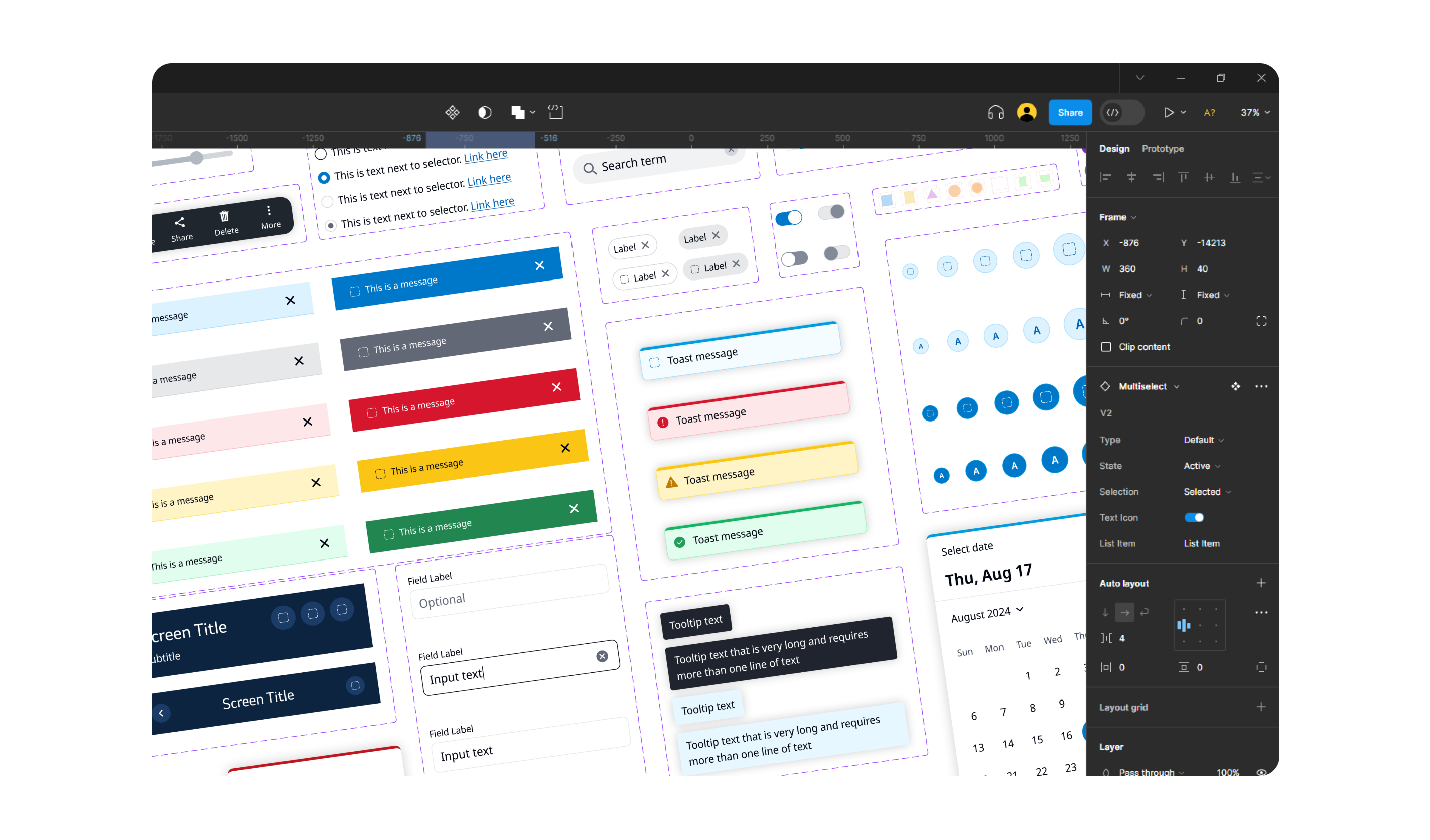
Crafting digital products through design framework
Shamir’s new palette: Adjustments
I created the color palette in alignment with the brand’s identity, yet with modifications for digital products. Here are some of the decisions I made:
- Switch color dominance – use more blues than reds (keep the reds for brand recognition elements)
- Take the celeste and gray and convert them into 2 blue accessible shades
- Interpret the brown color to reflect the diverse range of skin tones in people imagery
Colors
#23243D
Primary
#0C95FD
Secondary
#F7F8FE
Tertiary
#E51E2D
Quaternary
#FFFFFF
Quinary
#23243D
Primary
#0C95FD
Secondary
#F7F8FE
Tertiary
#E51E2D
Quaternary
#FFFFFF
Quinary
#23243D
Primary
#0C95FD
Secondary
#F7F8FE
Tertiary
#E51E2D
Quaternary
#FFFFFF
Quinary
Typography
Titillium
ABCDEFGHIJKLMNOP
QRSTUVWXYZ
abcdefghijklmnopqrs
tuvwxyz
Titillium
ABCDEFGHIJKLMNOPQRSTUVWXYZ
abcdefghijklmnopqrstuvwxyz
Titillium
ABCDEFGHIJKLMNOPQR
STUVWXYZ
abcdefghijklmnopqrstu
vwxyz

3.0 Showcase of patient archive screens
Continuation project
Streamlined dashboard design for optometrists
A continuation project
Following the initial project with Shamir Optics, the client requested a design for a dashboard system tailored to assist optometrists in tracking patients’ eye testing outcomes.
The app design concept was effectively translated into fully functional dashboard screens that meet both the aesthetic and functional requirements of the product.

4.0 Showcase of the dashboard main screen

4.1 Add user popover

4.2 Showcase of the job measurement screen
User-centric design for mobile
Dealing with challenges of mobile platform helped understanding mobile patterns and best practices.
Iterative color practices
The project involved a systematic approach to color selection for different components in their nature, which led to a process of experimentation and refinement.
Complex touch interactions
Gentle and intuitive gestures requirements were creatively solved by drawing inspiration from other fields.
Next project:
