Design System
SenseHub Design System
A global pharmaceutical company that manufactures
a wide range of healthcare products
Design System
SenseHub Design System (MSD)
MSD is a global pharmaceutical company that manufactures a wide range of healthcare products
Overview
SenseHub is at the forefront of innovation in livestock management, offering cutting-edge solutions to help farmers make data-driven decisions. By harnessing advanced sensor technology and real-time analytics, SenseHub enables dairy and beef farmers to closely monitor the health, fertility, and overall well-being of their herds.
I helped with the creation of a comprehensive design system which unified the product’s design language, improved handoff to developers, and ensured responsive design across various screen sizes.
My Role
UX Research, Visual Concept, Component building, Prototype, Dev Handoff
Team
Daphna K.
Timeline
July 2023 – Ongoing
Context
The SenseHub Umbrella
Unification of all products
Each field within the animal category was assigned with a distinctive color.
The organization began conducting a thorough inventory of all the digital products, cross-platform, mobile, dashboard and web. All stakeholders, including designers, marketing, developers and product managers were informed of the important decision: Design unification.
The meaning would be design integrity and scalability across their ever-evolving products and platforms.
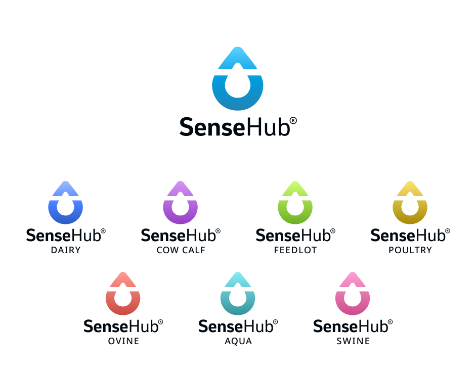
1.0 SenseHub logos by species
Problem Statement
Putting all the pieces together
Different design languages
Each species category had its own product designer, and there was a notable absence of design consistency across these different categories. This lack of cohesion made it challenging to establish an efficient workflow for the development teams.
New products kept on coming in the work flow but there was an absence of guidelines helping to integrate them into the system.
Lack of design system
Each product category had its distinct collection of design components and templates for every design element, from fields and tables to typography, etc. Unfortunately, these resources lacked consideration for development constraints and responsive design. every time a new design component was required, individual product designers made their own design decisions, leading to inconsistencies and variations between designers.
Insight
We needed to build a design system that would be capable of supporting 8 category species –
each with their own teams of designers and PMs.
Step #1
Research and Planning
Inspiration and approach
Researching industry leading brands design systems such as Atlassian, Sales Force, Airbnb, and mapping out all of our components, from simplest to most complex.
Identifing User Groups
The users of the design system who will use it eventually to create the interface are the designers, developers and product managers.
However, we also needed to understand the end users; the customers who will ultimately interact with the product’s interface.
Step #2
Defining the Goals
Breaking down the challenge
01
Achieve a common UI design for all products
02
Provide common UX solutions for similar problems in various products
03
Make the process quicker as we advance from product to product
04
Create an infrastructure that will make this task easier if marketing rebrands again in the future
Step #3
The DS Solutions
Tokens
A technical solution that allowed most UI decisions to change between products without touching the code.
Components
Building generic components that are maintained in a common library allowing us to manage changes easily in one place.
Communication
A set of solutions focused on bridging the gaps between design & development to make sure we’re all building the same things.
Step #4
Establishing a design system
UX and design researches
The process of building components and establishing decisions which would be cross categories was informed by in-depth UX researches. I was lucky enough to be part of a corporation that encourages deep thinking processes and researches.
Every research included the exploration of all potential variations for a component, icon, or interaction behavior. This involved not only identifying these possibilities but also integrating them into the interface and subjecting them to rigorous testing.
Foundations
Objects agnostic definitions such as typography, colors, shadows & icons.
Navigation
Elements used to navigate the app such as app bar, tabs, headers and global menu.
Buttons
All the button types such as floating button, text buttons and standard buttons
Elements
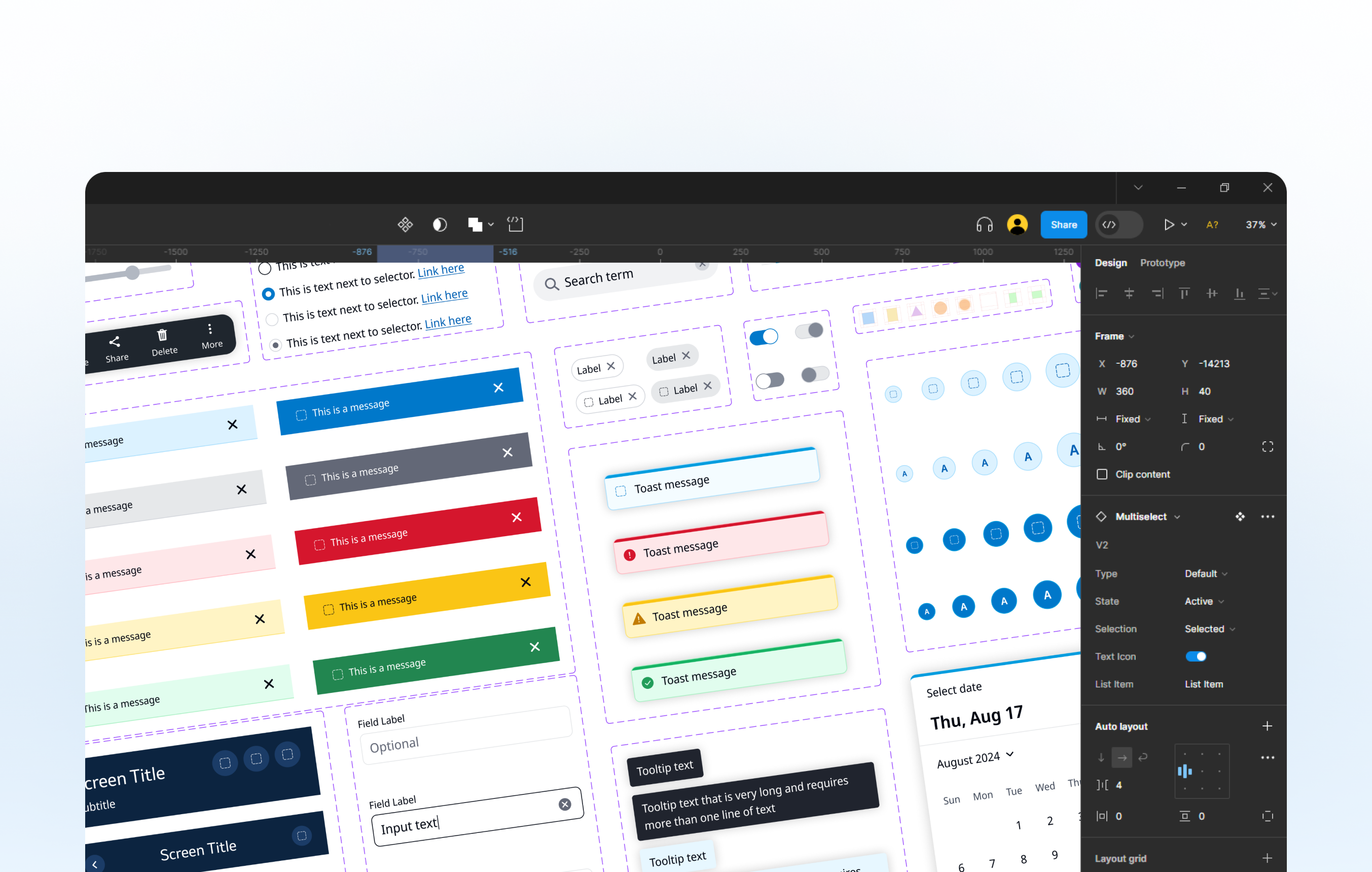
All general elements such as tooltips, chips, toggle, checkbox and more.
Lists
Content lists types like navigation & configuration lists with different features.
Forms
Building blocks like search, input and text fields, lists items and dropdowns.
Foundations
Objects agnostic definitions such as typography, colors, shadows & icons.
Navigation
Elements used to navigate the app such as app bar, tabs, headers and global menu
Buttons
All the button types such as floating button, text buttons and standard buttons
Elements
All general elements such as tooltips, chips, toggle, checkbox and more.
Lists
Content lists types like navigation & configuration lists with different features.
Forms
Building blocks like search, input and text fields, lists items and dropdowns.
Step #5
Developing a design concept
The approach
The development of the design concept and the establishment of the design system were a back-and-forth process since they were intertwined. As we crafted the design, we simultaneously identified the tasks at hand. This included determining the essential components, deciding on color usage across different areas, and repeatedly iterating on these decisions. Every element and conclusion required thorough testing and adaptation to cater to all categories.
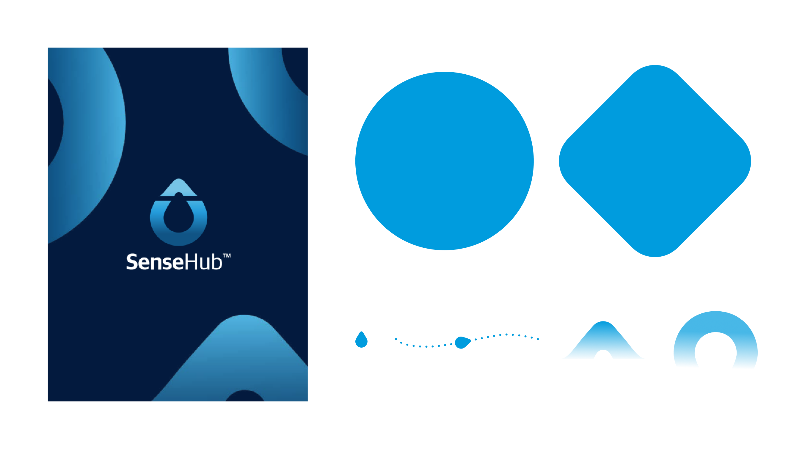
2.0 SenseHub branding language and design elements.
The goals of the concept
Suitable
Create a harmonious and efficient design concept that suits the individual products with different colors and unique features.
Ease of maintenance
Making developing, maintenance and updates more straightforward while reducing the risk of inconsistencies or errors.
Scalability
Integrating new products and updating existing ones for ever-evolving products is essential for the long-term success.
The goals of the project
Suitable
Create a harmonious and efficient design concept that suits the individual products with different colors and unique features.
Ease of maintenance
Making developing, maintenance and updates more straightforward while reducing the risk of inconsistencies or errors.
Scalability
Integrating new products and updating existing ones for ever-evolving products is essential for the long-term success.
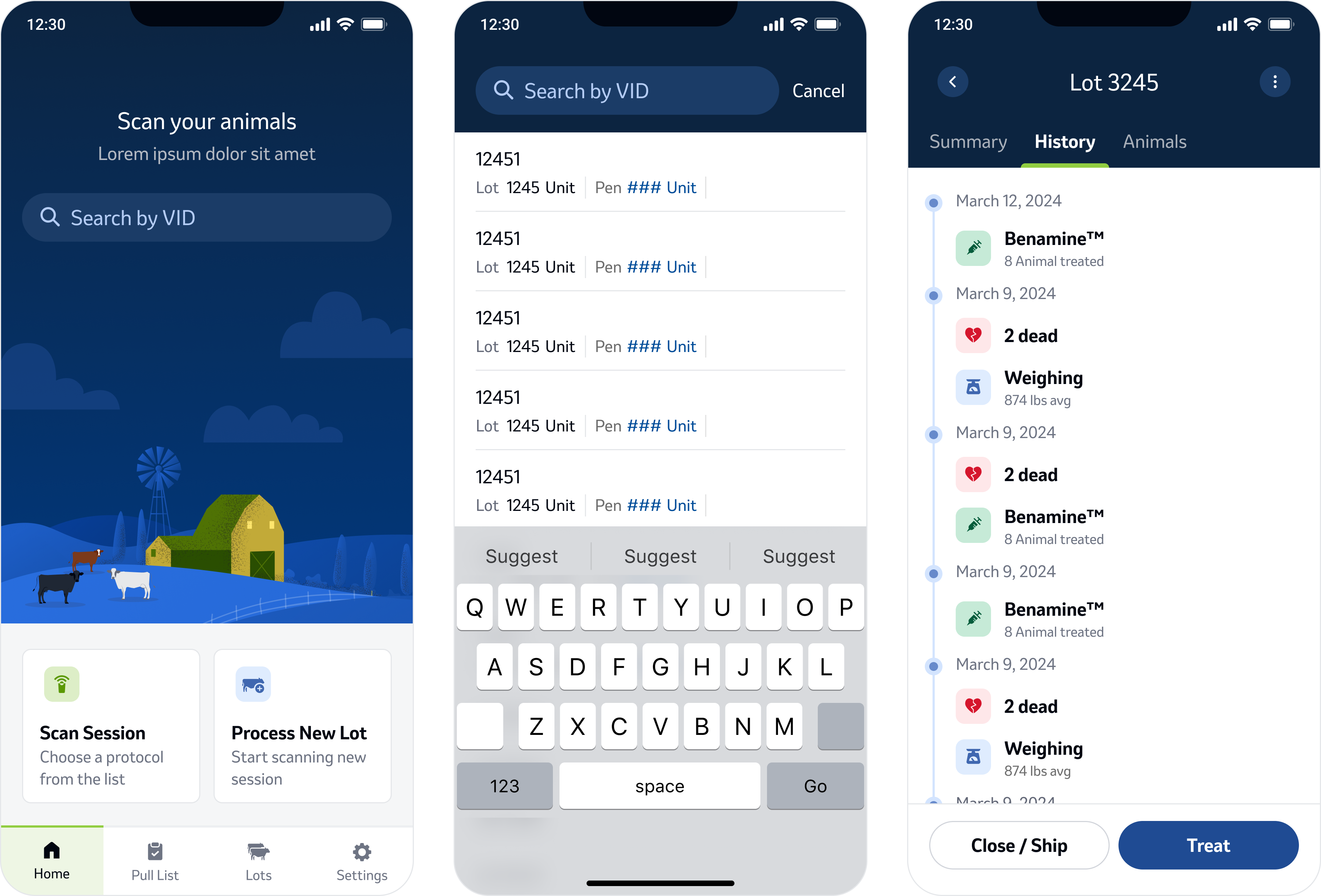
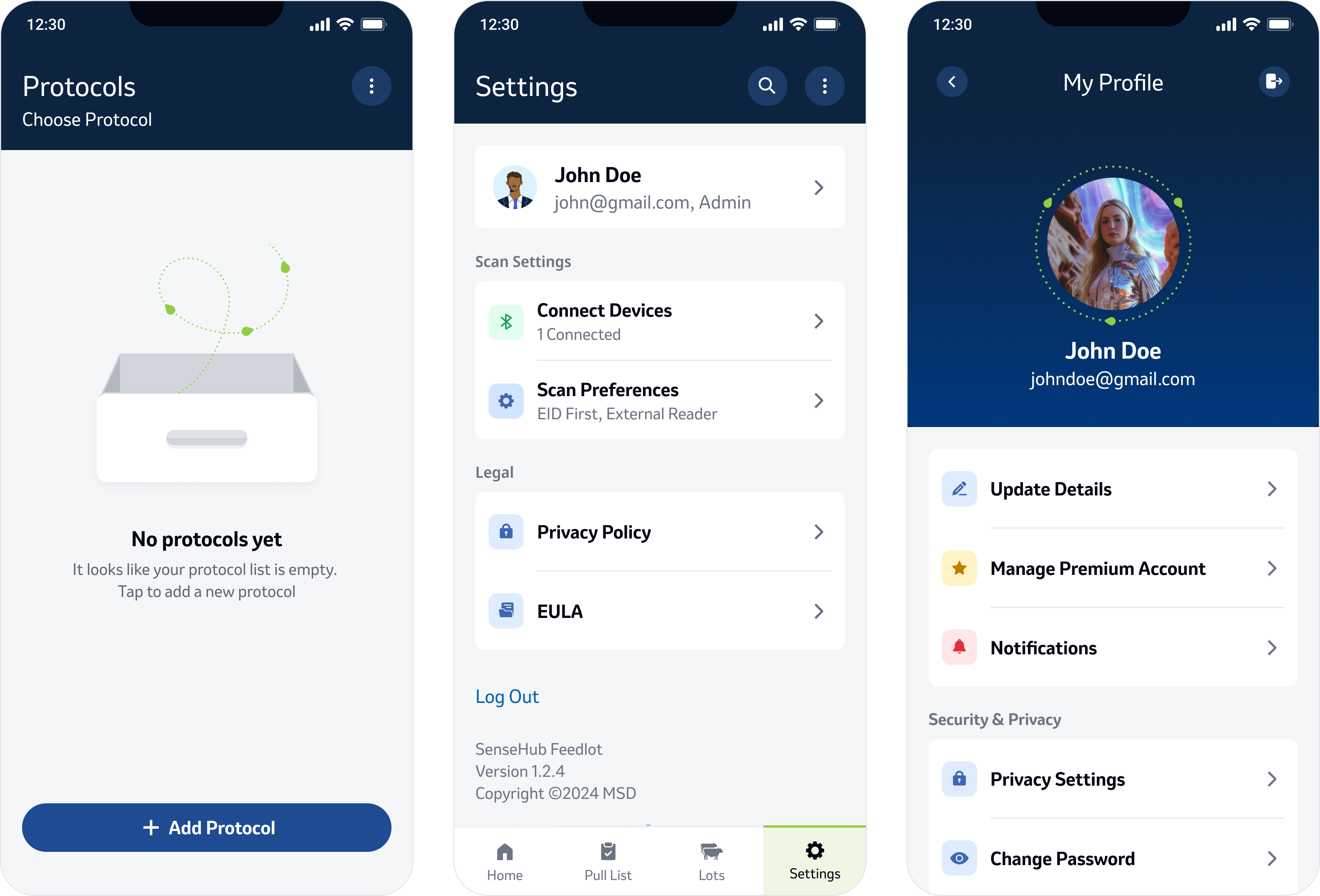
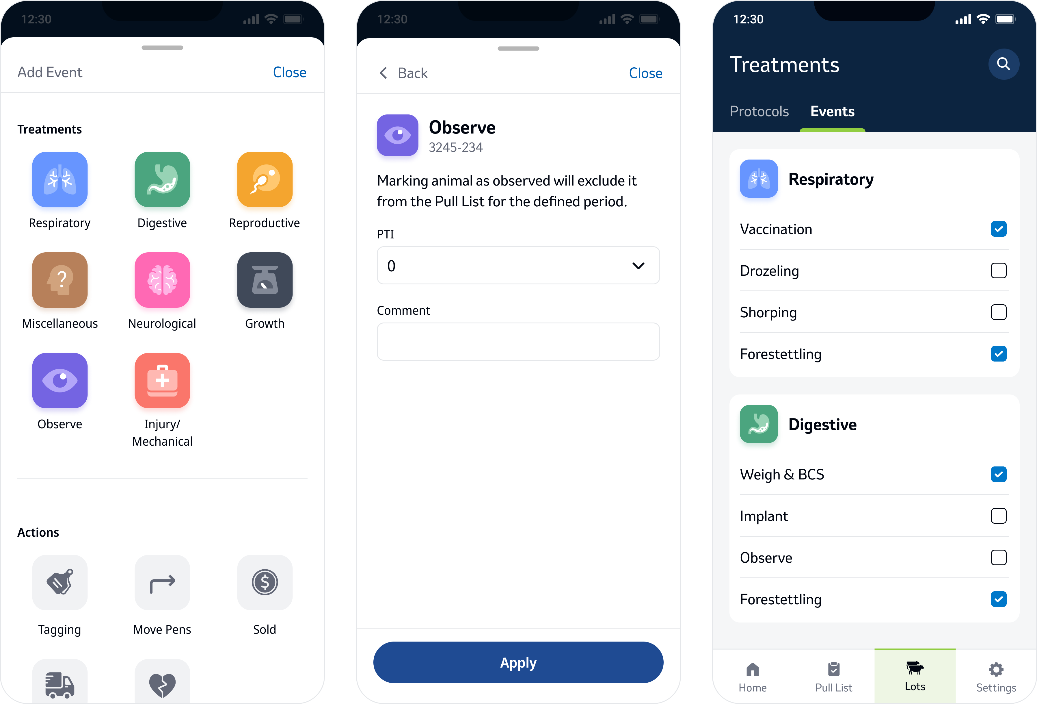
2.1 Mobile Design Concept
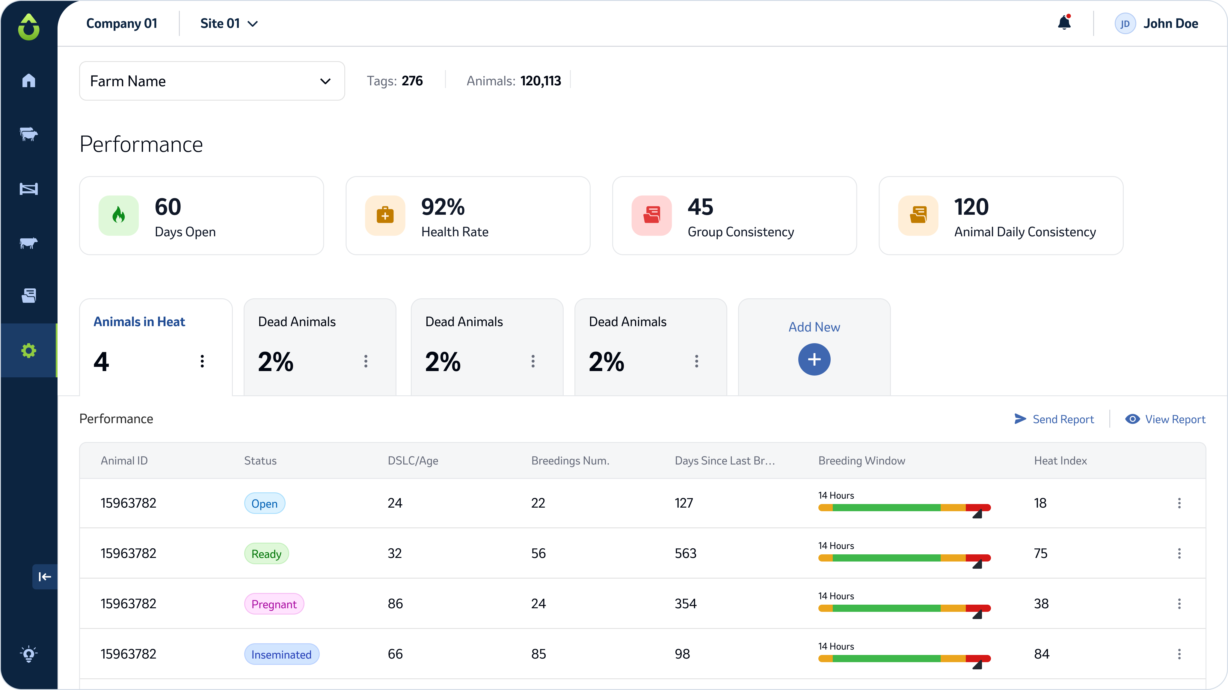
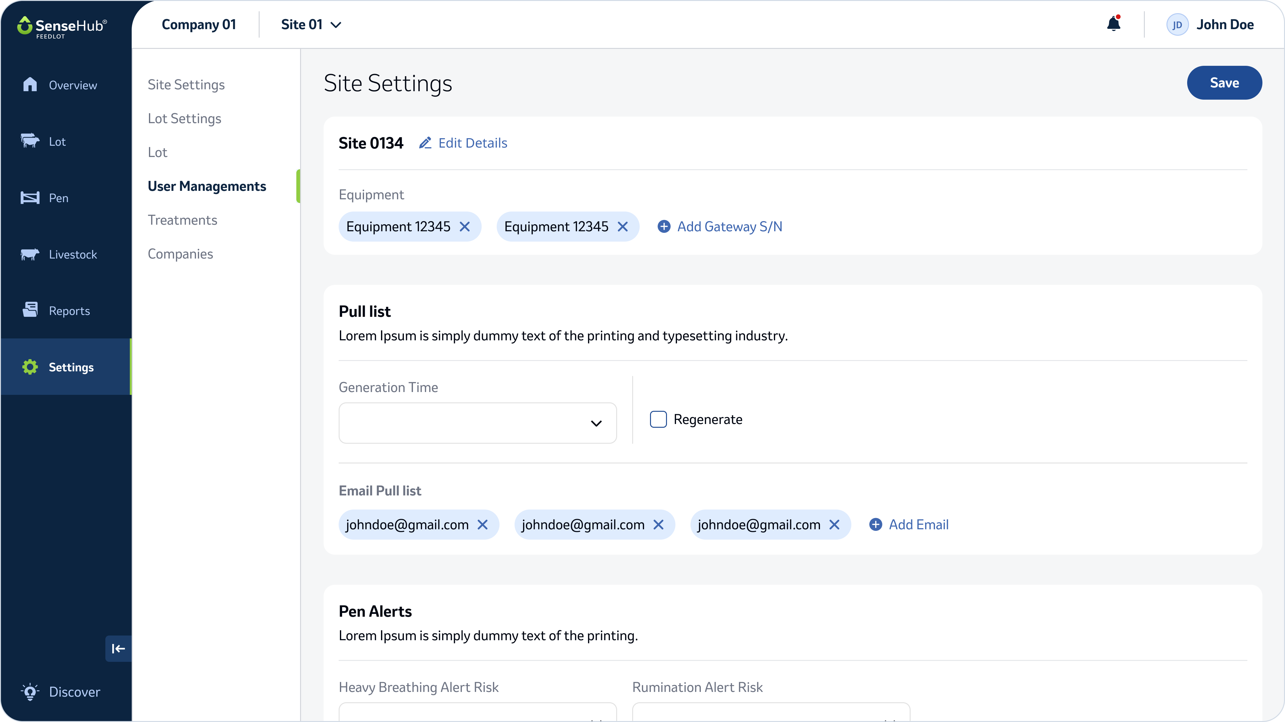
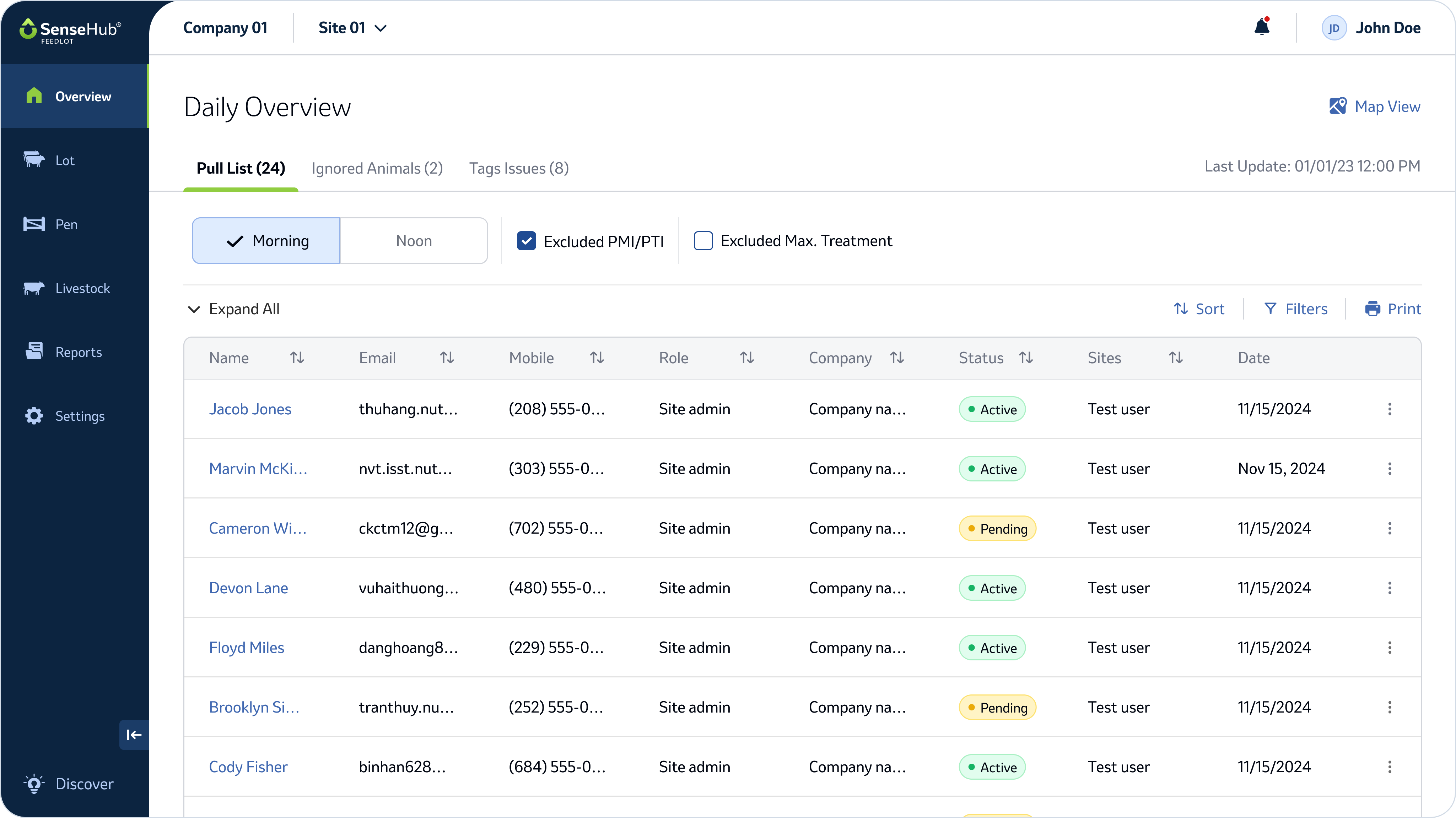
2.2 Web Design Concept
Step #6
Creating a Token’s System
Overview
We used naming conventions for certain kinds of design decisions to create flexibility in the design without touching the code.
Token types: colors, text styles, borders, shadows, spacing & sizes, icons & illustrations, etc. All tokens were defined in Supernova & could be exported to any technology or theme.
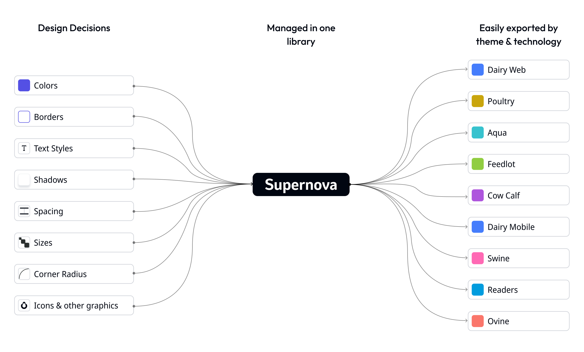
3.0 Showcase of design tokens management and exportability within the Supernova library
Colors
We built a color system of 3 tiers: Core (foundation color palettes), Semantic (meaning and context to the core palette), and Component (tailored for specific UI components).
Core
Defines the palette of various colors. used only by the DS team.

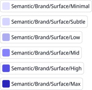
Semantic
Defines the functionality of the colors. used by product designers on screen & in by DS team in components
Component
Defines in components where color can change from product to product. used only by DS team.

Core Tier
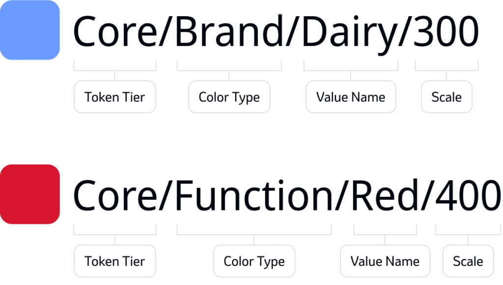
We defined the name structure of the core tier by:
Token Tier – To state that it’s core
Color Type – Brand/Accent/Neutral/Function
Value Name – Brand name or color name
Scale – Defines the tone of the color (we set the scale between 50-600)
Semantic Tier
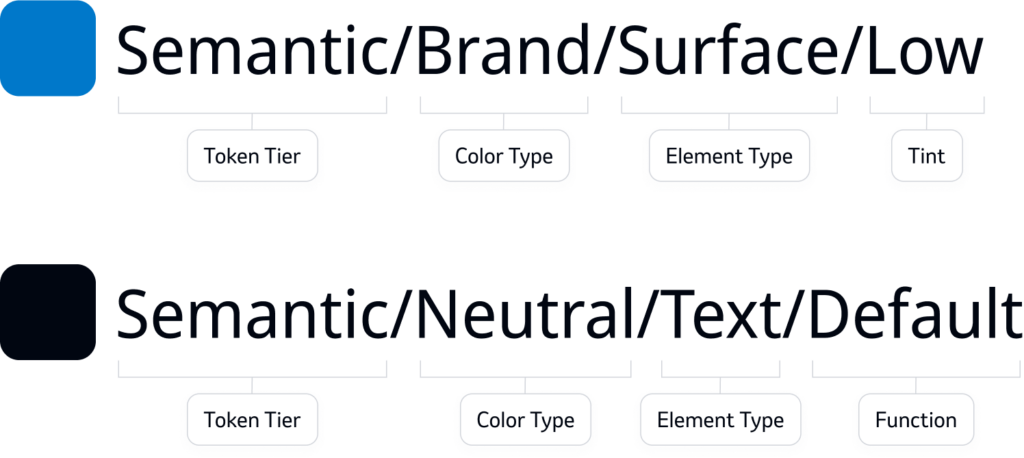
Semantic color name structure was a bit more complex since each element type has a way of being mapped out:
Token Tier – To state that it’s semantic
Color Type – Brand/Accent/Neutral/Function/Classifiers
Element Type – Surface/Text/Border
Tint – A scale from “Minimal” to “Max”
Function – If the color had a role like default or muted text
Component Tier
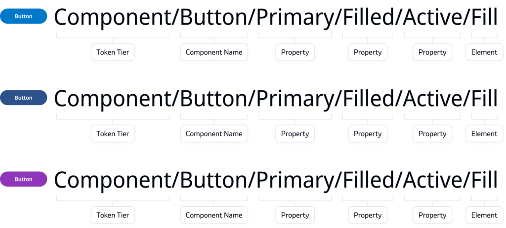
Was used within components to allow differences between products, it pulled it’s values from the semantic tokens.
Token Tier – To state that it’s component
Component Name
Properties – Each property that might have an effect on the UI is added to the name
Element – What part of the component is colored
Borders
We defined all border color tokens from the semantic variables & the range of thickness we currently maintain is 1-5px.
Core Tier
We defined the name structure of the core tier by:
Token Tier – To state that it’s core
Color Type – Brand/Accent/Neutral/Function
Value Name – Brand name or color name
Scale – Defines the tone of the color (we set the scale between 50-600)

Thematic adjustments
The design system’s elements, such as nav bars, buttons, tags and other graphic elements, were based on a semantic color scheme. Each product was assigned a core color scheme that incorporated the category color, following the logo’s color.
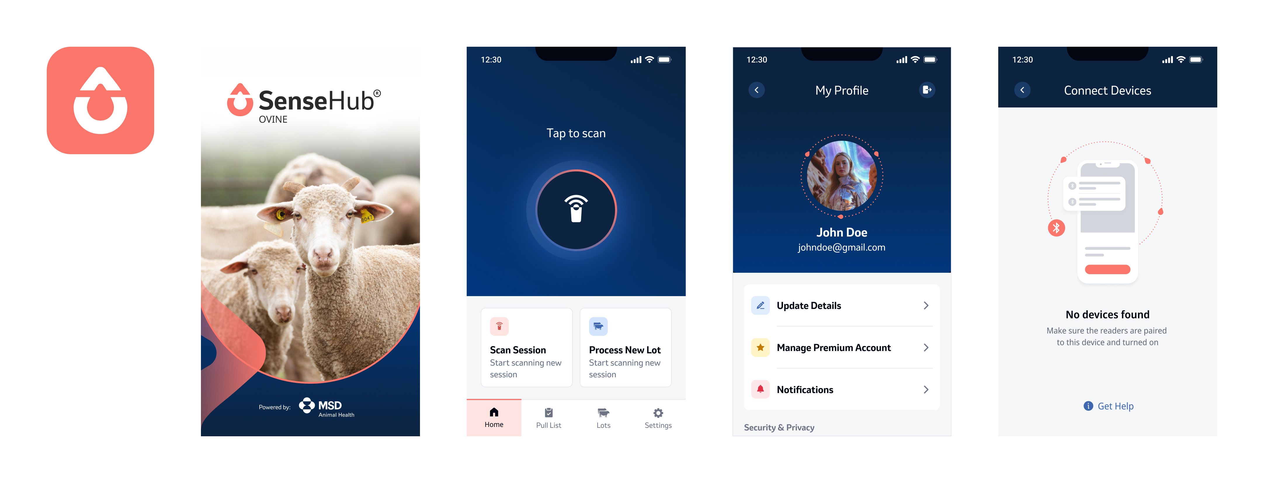
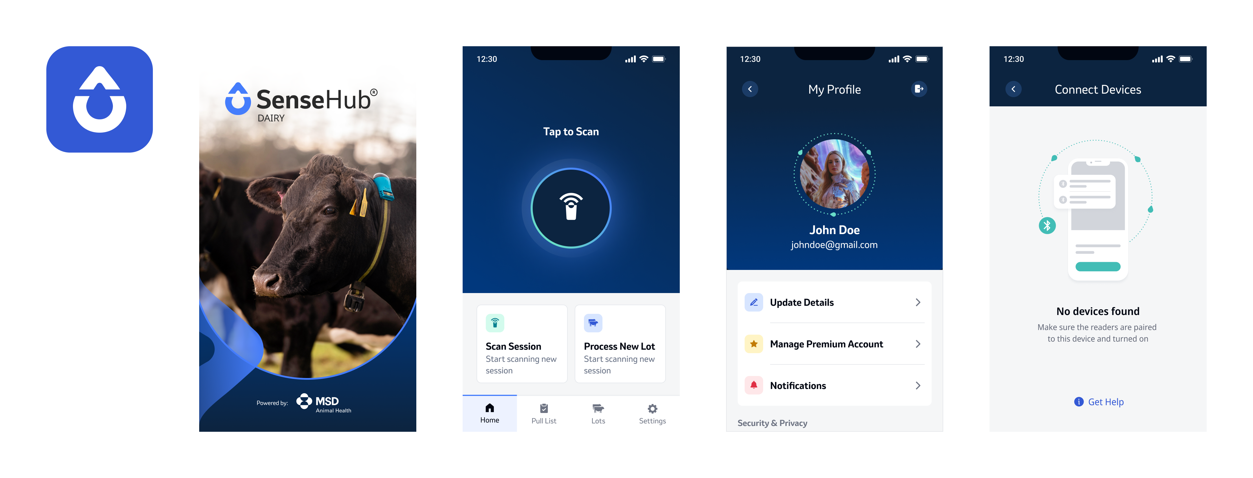
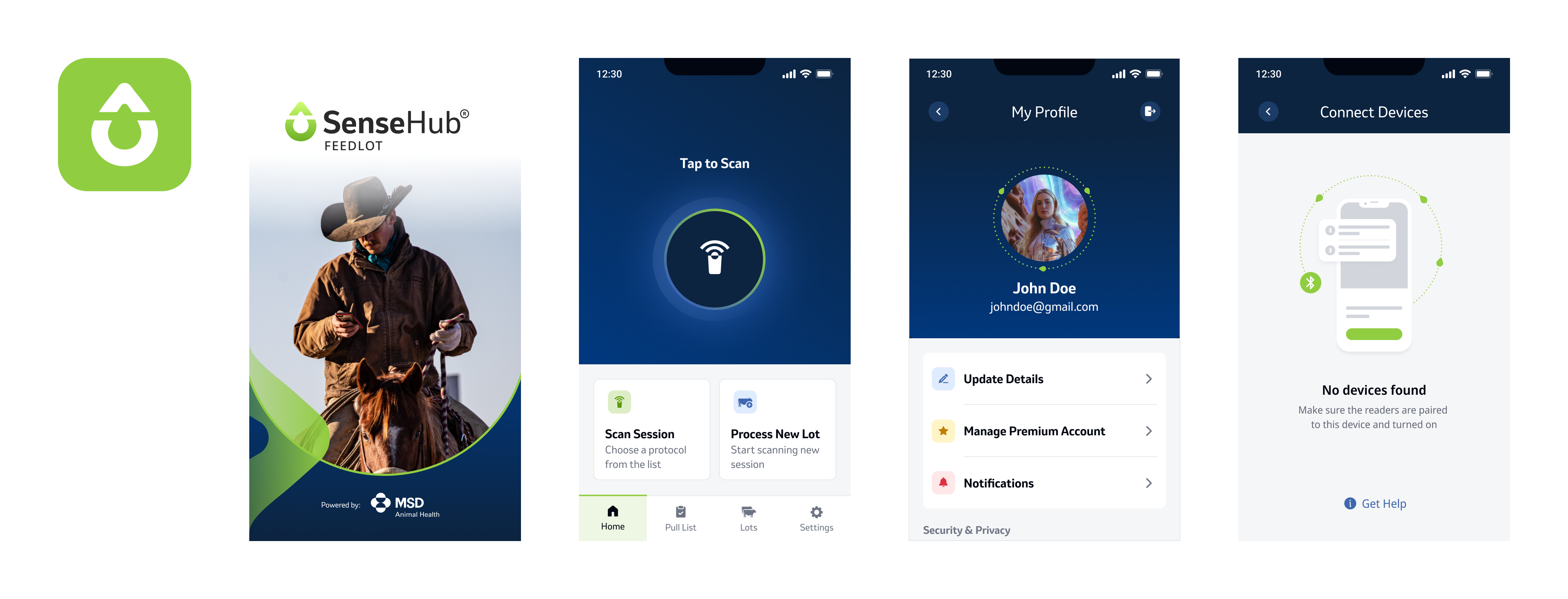
3.1 A showcase of the design concept applied on various species through variables
The outcome
The design system allows us to create diverse applications for different products, each with unique needs, users, and business considerations, while leveraging the same components with minor adjustments and minimal effort.
3.2 A showcase of 3 different apps
Step #7
Documentation
Dev Handoff
Each component (e.g., buttons, modals, form fields) is documented with its variations, interactions, and guidelines on when and how to use them.
We also mapped all component tokens (colors + sizes).
4.0 Documentation examples from Figma
Properties
- What features are possible in the component?
- Are there future feature we might need to support
- What visual elements can change between instances?
Structure
- How should the component be built to stay as scalable & flexible as possible?
- What are the alignments definition of the elements?
- What are the building blocks of the component?
Behavior
- What happens when user interacts with component
- Are there behaviors that are case specific?
- Are there behaviors that can be defined per instance?
Text Behavior
- How does text break in edge cases? Defined whenever text appears.
Responsive Behavior
- How does the component look in different breakpoints?
Tokens
- Technical definition of the design tokens in a component
Guidelines
- How should designers & developers use this component?
- Do’s & don’ts
Final words
What did we get?
The Outcome
The design system allows us to create diverse applications for different products, each with unique needs, users, and business considerations, while leveraging the same components with minor adjustments and minimal effort.
5.0 A showcase of 3 different product using the same components
Bonus Project
Visual Assets Libraries
A Systematic Design Process
I took on the role of the sole designer responsible for creating the complete suite of icons and illustrations for SenseHub. I started by immersing myself in the brand’s vision and tone, I developed a design language and style guide, which included standardized grid systems for shapes, as well as thematic rules to maintain consistency across all assets.
Icons
I created a complete icon library tailored to the brand’s needs.
For that, I designed icon templates that take into account various shapes, optical illusions, and alignments. These templates helped optimize the icon placement.
I utilized a 0.25-pixel grid to ensure the optimal rendering process for exporting the icons.

6.0 Icon templates designed by shape to create balanced optical illusions.
The Design Approach
As a team, we decided to adopt a filled icon style over outlined icons to enhance visibility and clarity.
To avoid the icons appearing overly “clogged,” I utilized inner elements to create white space, ensuring a balanced composition. Drawing inspiration from the brand logo (a drop shape) I used a combination of straight and rounded corners, giving a professional and a friendly feel.
Finally, I used diagonal angles across the icon designs to add a sense of rhythm and dynamism.
6.1 Icons Set
Empty State Illustrations
The visual language I developed for the empty state illustrations is grounded in soft, approachable elements while incorporating key brand elements, such as the drop shape and dotted line.
To keep a connection to the real life, the illustrations depict objects and scenarios as they exist in reality. For example, a pen fence is illustrated as it appears in everyday life, making the visuals relatable and intuitive for the user.
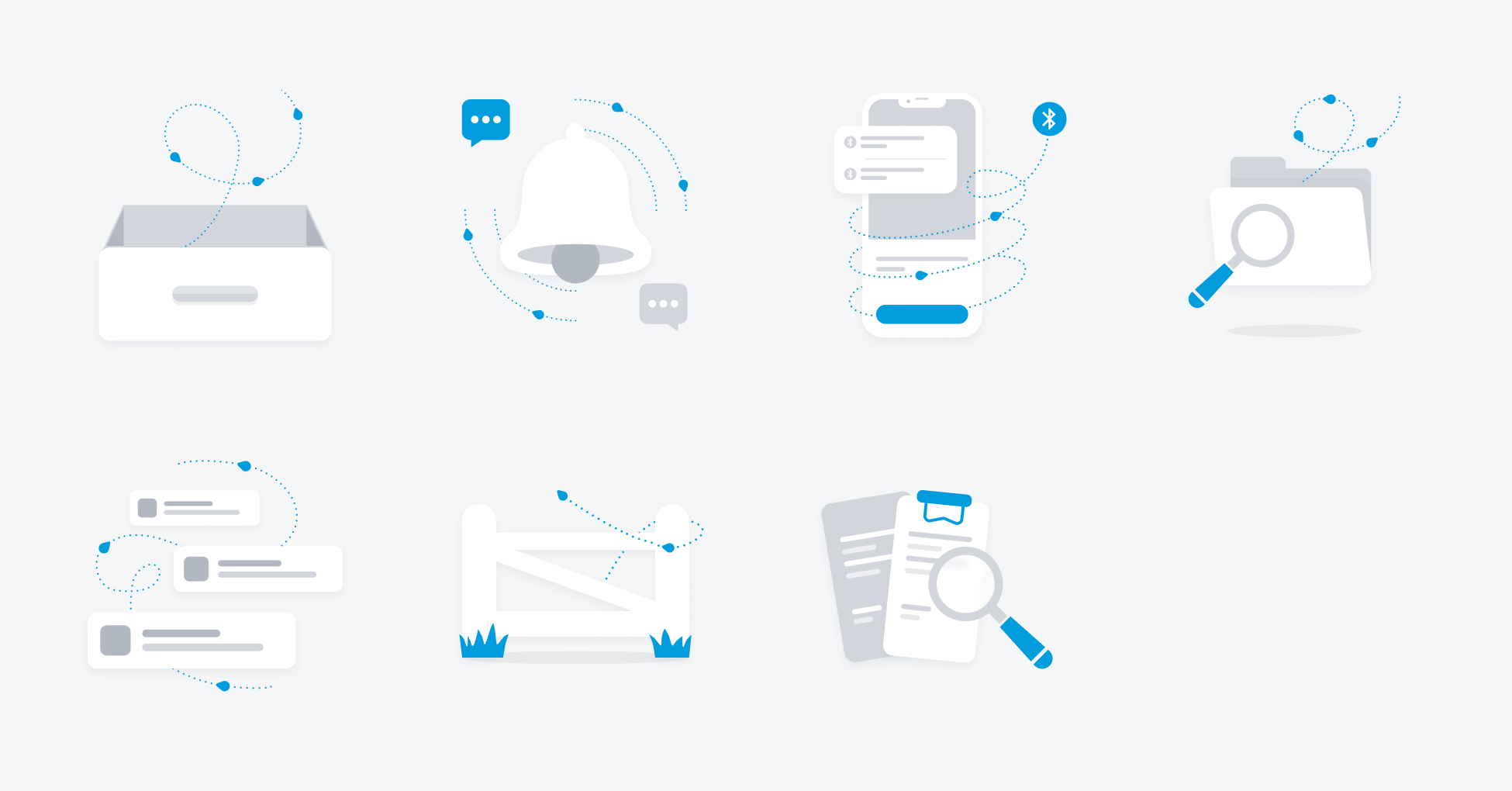
6.2 Empty State Illustrations Set
Next project:
