Self service digital kiosk
Ichilov Hospital
Tel Aviv Sourasky Medical Center (Ichilov) is Israel’s leading multidisciplinary healthcare institution,
globally recognized as a front-runner in the field of medical tourism
Self service digital kiosk
Ichilov Hospital
Tel Aviv Sourasky Medical Center (Ichilov) is Israel’s leading multidisciplinary healthcare institution, globally recognized as a front-runner in the field of medical tourism
Overview
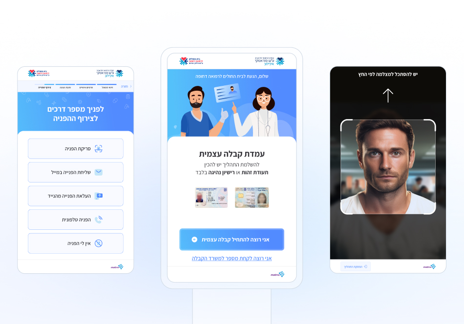
In 2022, Ichilov Hospital launched the first digital kiosk of self-check-in for their emergency room. This was an experimental intent to use a digital interface as a replacement of a human response for the sake of improving services and offering alternative methods for patients to check in at the emergency room.
After less than a year, Ichilov Hospital noticed that people were not using the digital kiosk or even noticing it – the digital kiosk was falling short of its potential as a viable alternative to traditional receptionist services.
That’s when they reached to seek our assistance in finding solutions to transform it into a more effective and valuable resource for self check in.
My Role
UX & Design Research, Visual Design, Illustration, Animation & Prototyping
Team
Moti Sarig, UX designer
Timeline
April 2023 – August 2023
Highlights
A digital kiosk as an alternative method for self-check-in at the emergency room
0.1 Review user flow


0.2 Showcase of screens
Context
Designing with empathy
Patients in need
The emergency room can be a distressing environment. Patients in pain, eager to receive urgent medical attention, often experience heightened anxiety and impatience while waiting.
The intention behind the digital kiosk was to expedite the waiting time, but in Ichilove Hospital case, it was barely in use.
Problem Statement
From awareness to assistance
Lack of awareness
The kiosk was not prominently displayed and the first screen did not inform about its purpose to the patients waiting.
Preference for human interaction
In emergency situations, patients might prefer the reassurance and guidance provided by face-to-face interaction with a receptionist or medical staff.
The interface design was alienated and did not give a sense of humanity – it lacked a human touch.
An intimidating interaction
There were a lot of accessibility issues and failures deterred older and less tech-savvy individuals from using the kiosk. The lack of clear contrasts and distinct sections on each screen made it difficult for users to visually divide their attention and comprehend the information.


1.0 Project process within timeline
Research #1
Analyzing digital kiosks patterns
Interface benchmarking results
High contrast
Contrast ratio of at least 3:1 is essential to make the content on the kiosk screen easily readable and legible in various lighting conditions.
Minimal hand movement
Minimizing the time and effort required to complete the task by reducing unnecessary hand movement leads to a smoother and faster user experience.
Mobile conventions
Meeting users expectations by following mobile conventions can lead to a more positive user experience and reduce user frustration.
User-centered approach to language
Using a simple and human-like language reduces cognitive load, more easily understood, boosts users’ confidence and prevents user errors.
Research #2
Finding the failures in the existing product
Discover, Understand, Engage
After establishing a foundation of best practices, I started identifying issues within the current interface and uncovering any missing elements.
I used a method of user interaction that encapsulates the core steps a user should go through: See/Discover, Understand, Act/Engage.

2.0 Old main screen – problems
Main screen
Discover?
A non-intuitive abstract icon lacking clear medical symbolism and failing to evoke a sense of humanity
Understand?
A small call-to-action text not visible at a distance – resulting in a lack of awareness regarding the option for self-check-in.
Engage?
Unclear button label – “Start” – induces uncertainty about the required action.
Design approach issues
It was more than visual aesthetics that stood out in looking at the current design. The most significant thing was the lack of readability, primarily due to low contrast, excessive use of shadows, small interface components, and a deficiency of clear sections to guide users’ attention to the relevant content.
2.1 Old inner screens – problems
Inner screens
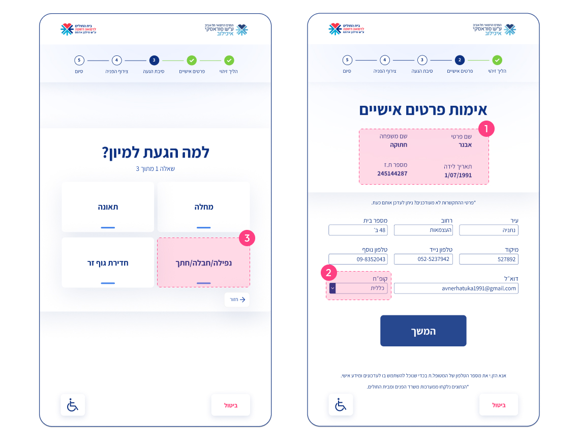
Too much information
This screen presents users with two required actions:
1. Review personal details, 2. Edit them if necessary.
This approach may lead to information overload and unnecessary steps.
Small tap targets
From fields to buttons, the components are small in size, which can make the tapping action challenging and prone to being missed.
Excessive use of shadows
Soft shadows gives blurry and indistinct edges. This creates unclear boundaries between elements. Elderly or patients with physical and cognitive conditions that affect their ability to maintain focus may interpret this effect as visual distortions.
Insight
The user’s physical and cognitive conditions are unknown and might not be optimal, so the interface shouldn’t just be empathic, friendly, clarity, but also minimize cognitive load, and require as little thought as possible.
Solutions & outcomes
A friendly, human-like experience
A welcoming face
For the interface to emulate a personal experience, I added a friendly illustration of a doctor and a nurse welcoming the patient. A human face is the most prominent and comforting element, and it’s what someone entering an emergency room is likely to seek out first.
3.0 Main screen playing
“Discover”
The colors, the characters and the movement will draw the patient attention and solve the problem of awareness.
“Understand”
A very clear copy describing the interface’s purpose, explanatory text that outlines the essential requirement (ID) necessary to complete the task, aiming to minimize errors and user frustration.
“Engage”
The call-to-action (CTA) buttons feature straightforward and user-centered copy, designed to eliminate any sense of confusion (“riddle”). Secondary CTA offers to start the alternative process.
The purpose of this screen is to lead patients to perceive it as the beginning of the registration process. While some may choose the traditional route, others may opt to follow the suggested interface flow.
Familiar and reassuring
In functional places where the user is required to take action and interact with the interface I incorporated mobile design patterns to meet user’s expectations. The following example illustrates how the screen behaves when the keyboard is displayed.

3.1 Mobile convention example – personal details


Visual design
A simple touch to achieve a friendly look
Style Guide
Ichilov have their distinctive color scheme and logo, which helped shaping the overall style guide in that line, while maintaining the desired simplicity.
The friendly look was achieved by the soft icons and illustrations.
Colors
#528BFF
Primary
#55C1FA
Secondary
#35353A
Tertiary
#528BFF
Primary
#55C1FA
Secondary
#35353A
Tertiary
#528BFF
Primary
#55C1FA
Secondary
#35353A
Tertiary
Typography
Assistant
א ב ג ד ה ו ז ח ט י כ ל מ
נ ס ע פ צ ק ר ש ת ץ ם ן
Iconography
Iconography
Animations




The launch of the digital kiosk was a moment of great excitement for me. Not like apps or dashboards, a digital kiosk seamlessly integrates with the physical environment, and its presence in the space made me proud.
What makes this project even more meaningful is to know that its purpose is to assist patients. This aspect adds an extra layer of satisfaction to the project.
The overall experience has become more transparent, clear, user-friendly, and even enjoyable!
Designing with empathy
Using empathy as the guiding tool in the design work helped develop my user-centric design skills, and become a better problem solver.
Holistic approach
Design an interface aimed to be used in a physical environment included considerations of context of new factors like lightning, noise, foot traffic etc.
Illustrations are fun! And helpful
By incorporating illustrations to infuse a sense of humanity into the interface, I learned to utilize graphic elements as supportive tools.
Next project:
