Web Application
Agam Liderim
Agam Liderim is a company specializing in financial
monitoring, compliance, and support systems.
Web Application
Agam Liderim
Agam Liderim is a company specializing in financial monitoring, compliance, and support systems.

Overview
Agam Liderim is a web platform built primarily for insurance agents to oversee the development of insurance portfolios for their clients.
I owned and led design strategy for the new app interface – playing a critical role in structuring the screens. This would be particularly significant as the product would go through a modernization process during a time when online meeting platforms like Zoom and Google Meet gained popularity in the post-Covid-19 era, when clients suddenly became viewers.
This would be a project based on an existing product, collaborating with a UX expert while handling branding decisions, accessibility issues, creating a comfortable working environment and addressing various other aspects to ensure a seamless user experience.
My Role
Design Research, Visual Concept, Prototyping
Team
Maytal Sagi, UXE
Timeline
Dec 2022 – Ongoing
Highlights
Modernizing a company-wide portal used to oversee development
of insurance portfolios
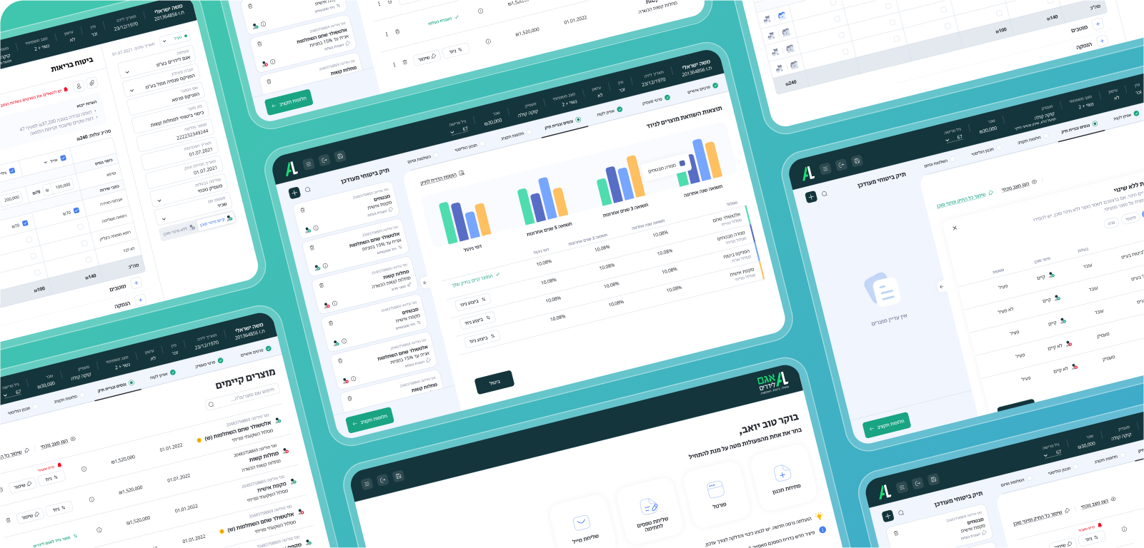
0.1 Flow screens showcase
0.2 Customer file collapse behaviour
0.3 A showcase of the main flow
0.4 First screen animation concept
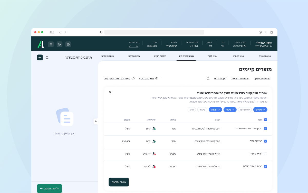

0.5 Preservation of an existing portfolio
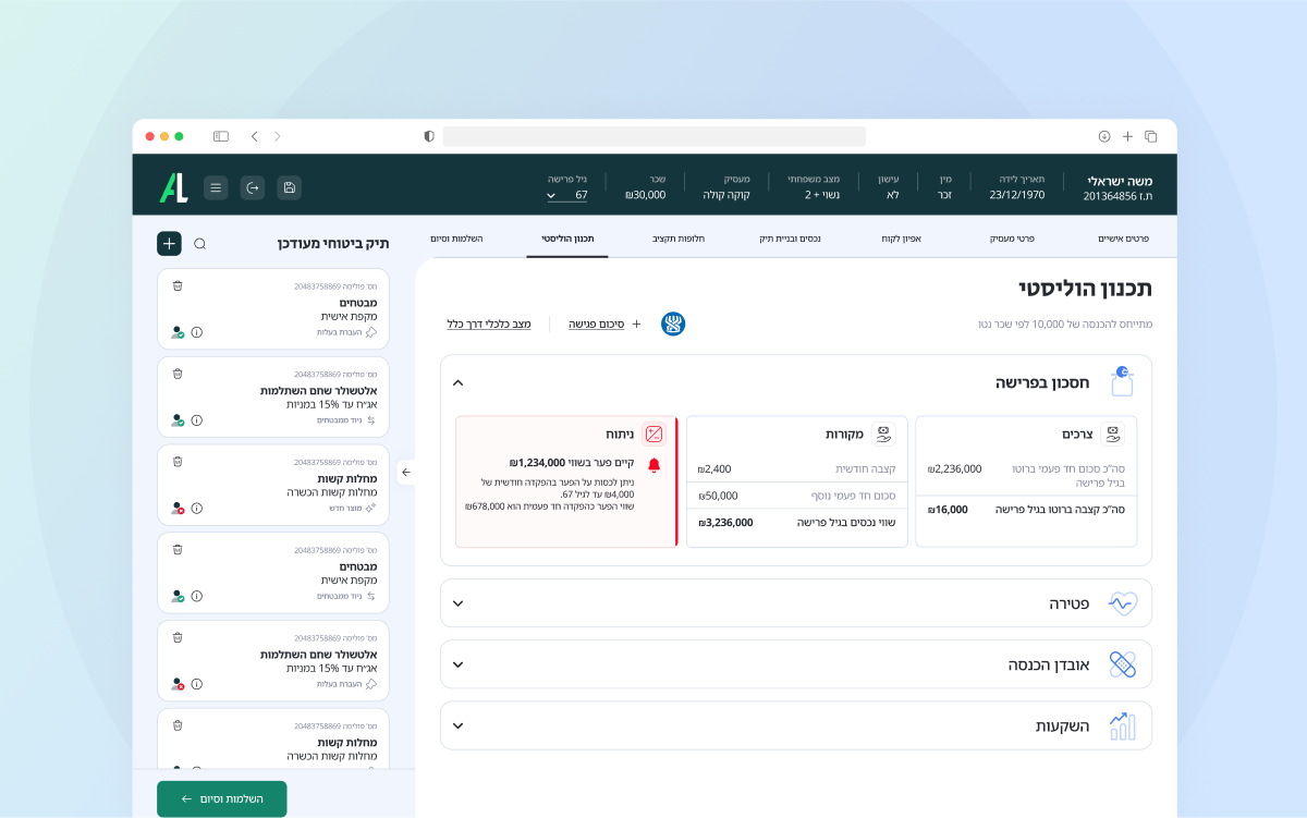

0.6 Planning analysis
Context
A new direction for Agam Liderim
15 years of minimal investment
Agam Liderim approached us after Covid 19 pandemic, which brought about a shift in their customer interaction dynamics while monitoring insurance. The system existed 15 years with minimal investment in user experience, however, with the transition to Zoom meetings for agents, customers were now exposed to the interface.
The system’s appearance had to evolve to be not only functional but also aesthetic, as it now played a role in marketing the company’s services.
“Different areas with different purposes should look different”
“Editing and viewing the system’s data are the two main flows of the system’s managers”
“It’s very important to be able to see the existing portfolio of the client through the process”
“For the portfolio managers, a professional, pleasant and comfortable working environment is a must have”
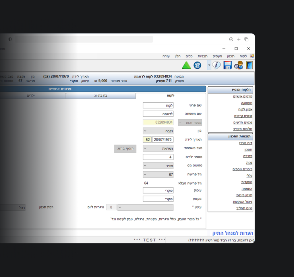
1.0 Original interface & user’s inputs
Problem Statement
This wasn’t going to be a friendly encounter
The flow to decision making
As the sales process progresses, clients are exposed to various screens, particularly those where they select products to include in their policy.
However, clients faced challenges in comprehending the sequence of steps that agents guided them through. They encountered difficulties in pinpointing their current phase within the process and discerning distinctions between the screens.
Took you long enough…
New and inexperienced agents who were unfamiliar with the system encountered difficulties due to its structure and faced a steep learning curve.
Back to 95′
The interface had a “95′ windows” look, loaded with information causing confusion and cognitive overload, as well as lack of trust. Furthermore, it lacked a distinctive design identity or character in its screens and components.
Assumption
Prioritizing visual content would help users grasp the product’s utility, and clients would be able to understand the product’s features without being swamped by excessive details.
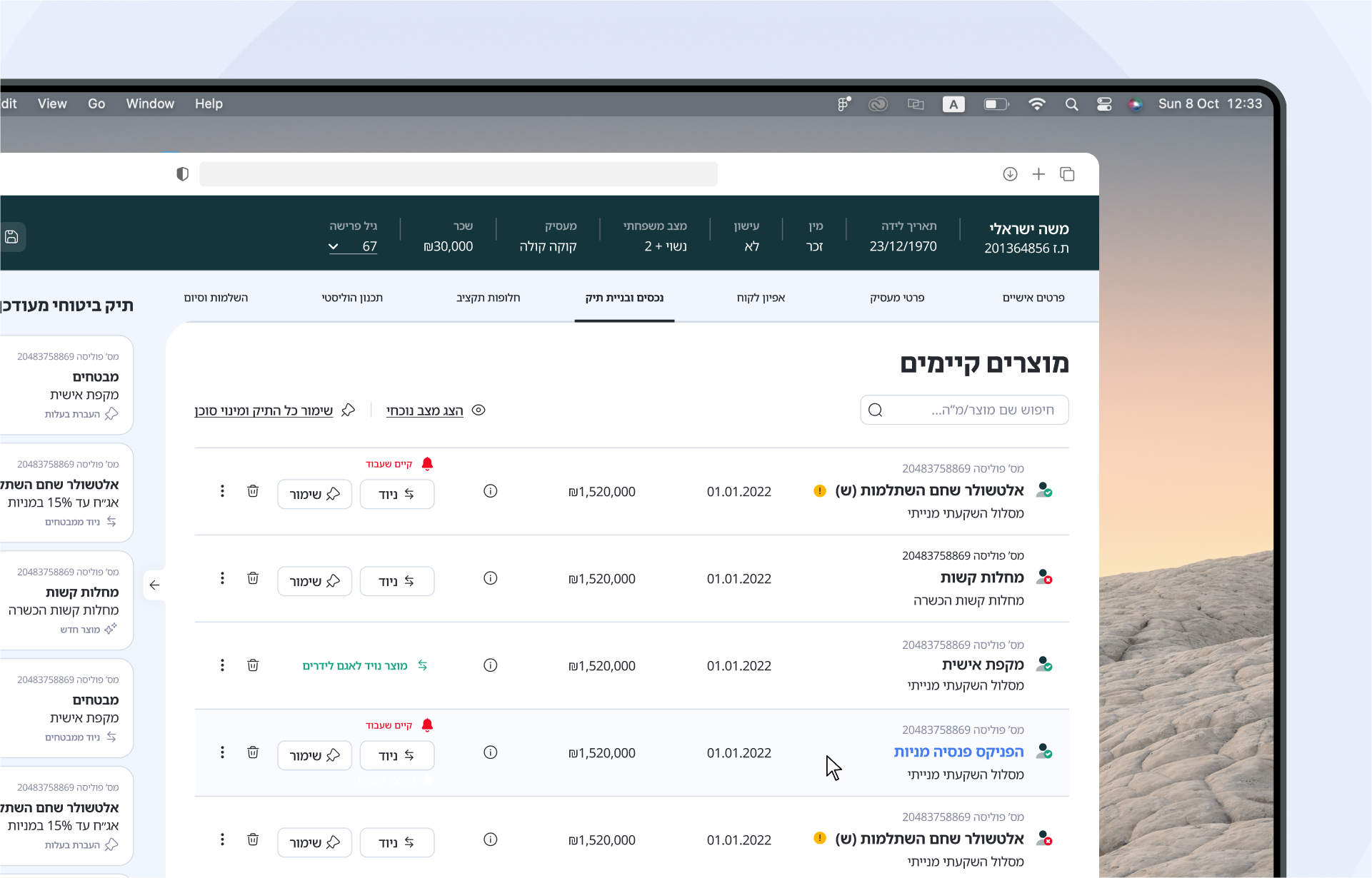
1.1 Existing assets page
Reconstruction of processes
Agam Liderim design principles:
The backbone of the project

Prioritize
Treating each data type as its own distinct module and prioritizing importance level following its impact on the user.

Balance
Balancing information disclosure with visual representation of both content and user actions.

Design
Enhancing legibility through visual indicators and elements such as large headings and iconography.
The backbone of the project
Prioritize
Treating each data type as its own distinct module and prioritizing importance level.
Balance
Balancing information disclosure with visual representation of both content and user actions.
Design
Enhancing legibility through visual indicators and elements such as large headings and iconography.
Sticking to the main flow
Mapping and segregating the different processes to align with the user needs (agents, clients, system managers) while putting the spotlight on the main process: pension sales.
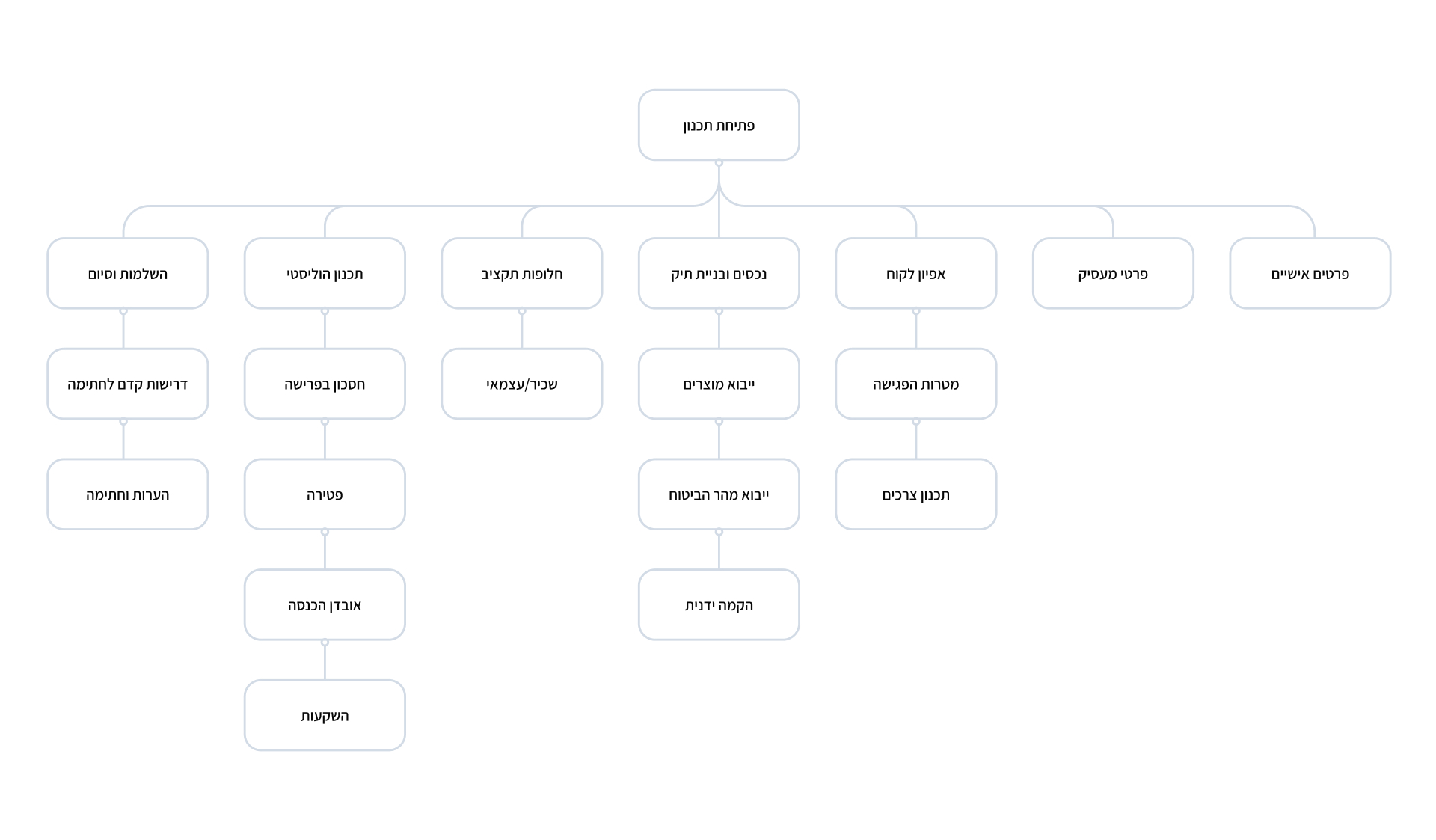
1.2 Agent’s Workflow
Navigation
A new navigation for Agam Liderim
What’s the bread & butter?
The system was screaming “lack of hierarchy”. All components look the same in their appearance and behavior, making it challenging to discern their importance and roles.
There was an unnecessary layer of navigation, and lack of treatment to support overlooking legibility & formatting.
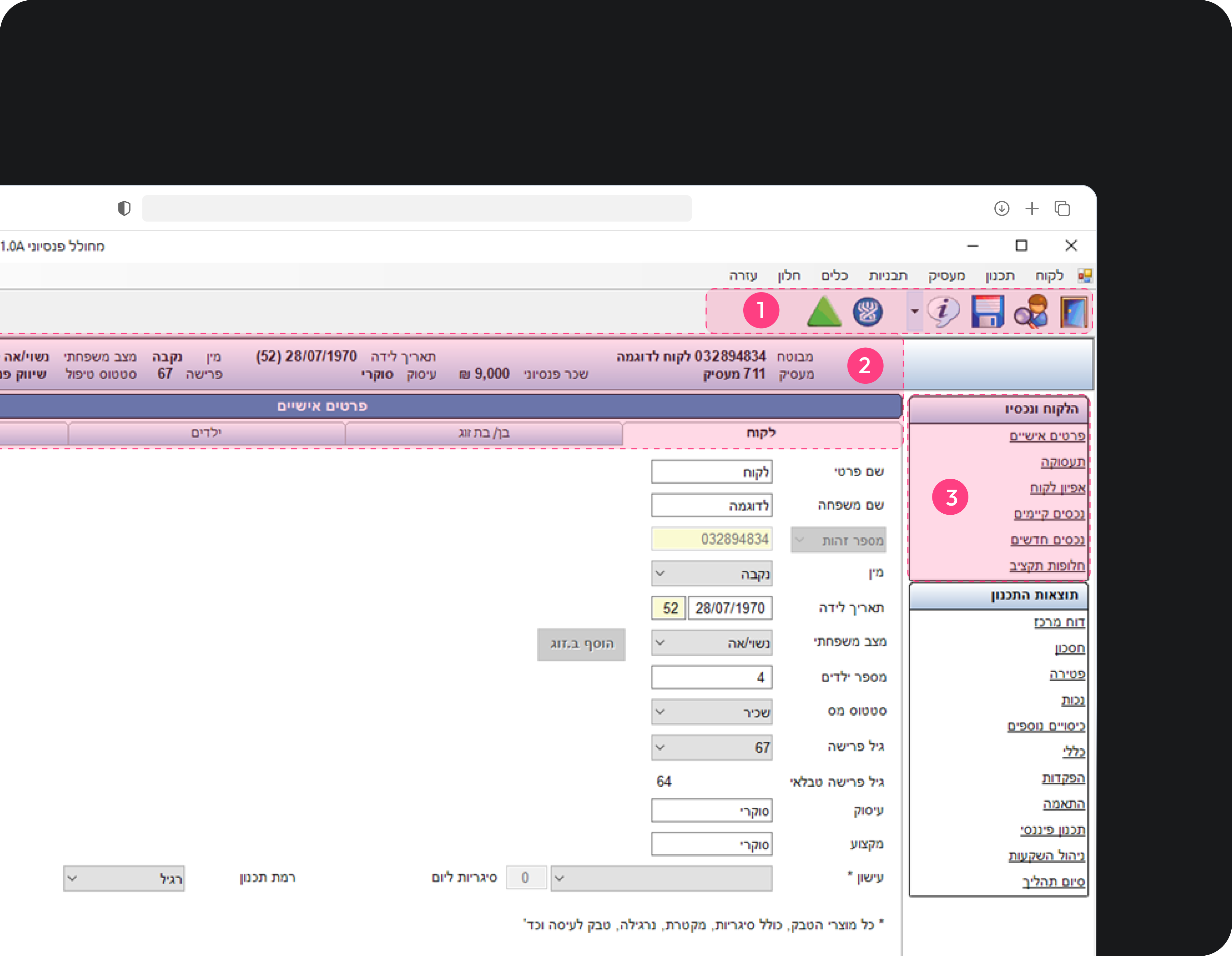
User actions bar (the agent)
An external bar serving the agent which includes actions regarding the system
Top section of client’s details
The client’s details appear throughout the process
Links to the process phases
The process is not linear, therefore the agent can “skip” and go from one link to another

1.3 System Navigation
User actions bar (the agent)
An external bar serving the agent which includes actions regarding the system
Top section of client’s details
The client’s details appear throughout the process
Links to the process phases
The process is not linear, therefore the agent can “skip” and go from one link to another
1.3 System Navigation
Insight
Placing these three components at the top frame of all interface screens would
establish consistency and a strong hierarchy.
The new and improved structure
It was my job to determine the optimal page structure for Agam Liderim’s system, based on the UX research.
At the top of the hierarchy, spanning the entire screen, I positioned the customer’s details alongside the system navigation, creating a unified experience. The content area would be complemented by the flow navigation, which affects it, and the customer’s file remained consistently visible to both agents and clients, occupying a fixed position in the left side of the screen, allowed for easy collapsing and expanding.

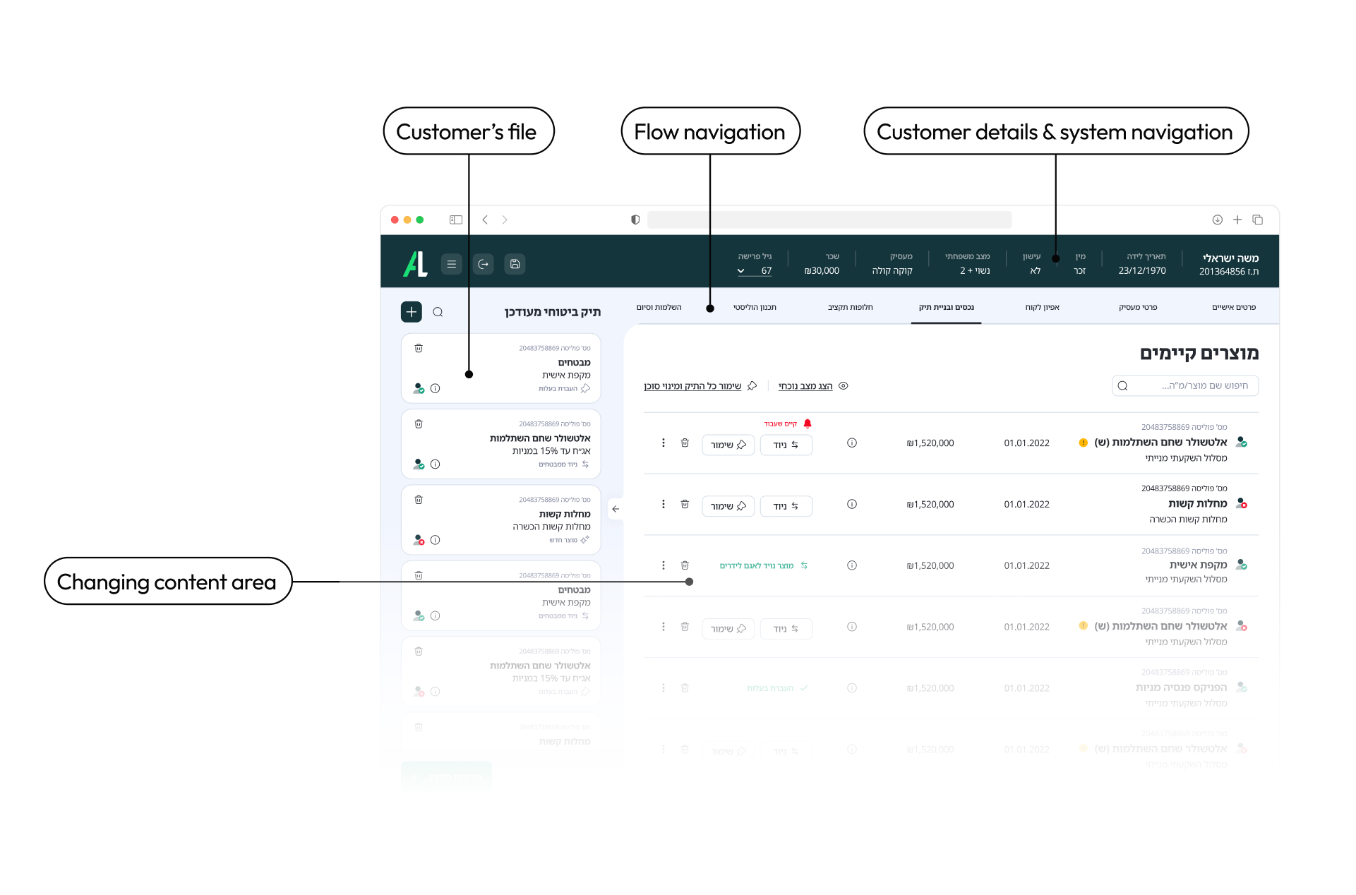
1.4 Infographic layout sheet
Layout & visual representation
It’s all about foreground and background
More control
As the system is loaded with actions and advanced features, I made a distinction between primary and secondary features, adding supportive components like anchors and indicating signs which guide the user in his progress.
Foreground VS Background
Using foreground and background components helps prioritizing visual content.
Insight
Showcasing the products in clear blocks against a light grey background
can simplify and reduce user confusion
Visual design
Building a design concept
A logo is not enough
Agam Liderim were not sure about their identity so I had to help them find out what it was about – starting from the company’s logo.
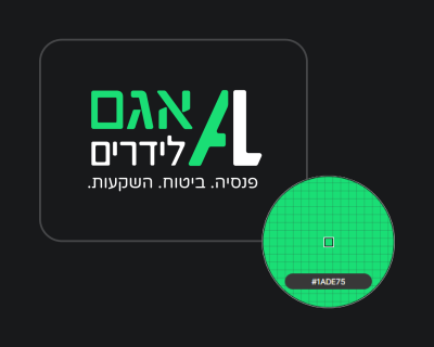
Accessibility issues
Agam Liderim’s brand green color is not an accessible color and therefore cannot be used in buttons, cards etc.
Functional color
In the digital world, the color green has come to denote a success. The brand’s distinctive shade of green may be associated with success messages and positive gestures.
2.0 Agam Liderim’s Logo
Insight
Modifying the brand color would help achieve a harmonious balance without using the brand’s identity
+
Adding a second color would enrich the design and contribute to the hierarchy of the interface
Starting with what I had
I initiated the design decision-making process by using Agam Liderim’s website as a reference point. That’s where I noticed the dark green strip which I chose to incorporate into the new design. I also adopted the look and feel of the website’s icons to maintain visual consistency.
2.1 Agam Liderim’s Website Homepage
Playground proccess
The first step was assessing the hierarchical importance of each section and determining whether it should be placed in the foreground or background.
I created a moodboard based on dashboard systems and analyzed their layouts and page organization.
For the project kick-off, I presented to Agam Liderim various design concepts. Once the preferred layout was selected, I created a Playground eaturing the same screen with different combinations of green, blue, and gray colors, while testing their relationships.
Ultimately, the decision was made to blend these three colors together.

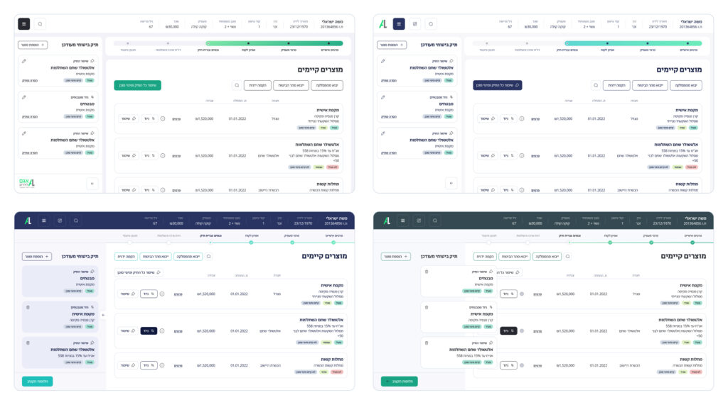
2.2 Representation of first design concepts
Style Guide
The style guide was developed phase by phase through the first 2-3 month of the project, according to evolving design needs and requirements.
The color palette was crafted based on the adjusted green color and the added blue. Contrast was achieved incorporating darker tones, such as dark green and gray, alongside light backgrounds drawn from various shades within the blue palette.
Colors
#14856B
Primary
#447DF0
Secondary
#262930
Tertiary
#14353C
Quaternary
#FFFFFF
Quinary
#14856B
Primary
#447DF0
Secondary
#262930
Tertiary
#14353C
Quaternary
#FFFFFF
Quinary
#14856B
Primary
#447DF0
Secondary
#262930
Tertiary
#14353C
Quaternary
#FFFFFF
Quinary
Typography
Noto Sans Hebrew
א ב ג ד ה ו ז ח ט י כ ל מ
נ ס ע פ צ ק ר ש ת ץ ם ן
Iconography
Iconography
Buttons
2.3 Modified button component
Components

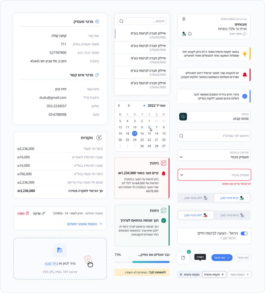
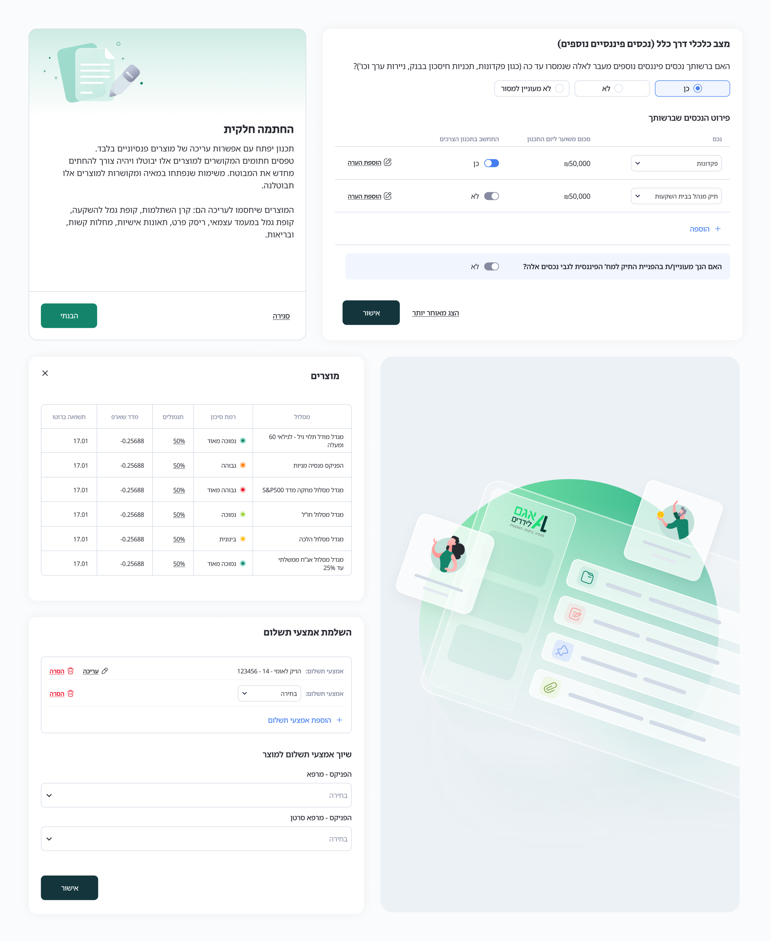
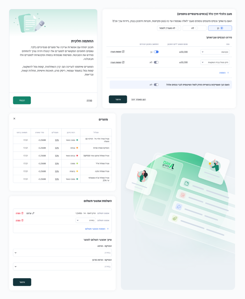
Data Visualization


Constraints are opportunities
Adapting to changes helped brew new approaches to managing the ever-expanding volume of content within the product.
Hierarchy is key
My experience enabled me to gain valuable insights into hierarchy, uncovering innovative methods and techniques to effectively establish it.
Uncertainty can spark imagination
Not having a concrete direction of design pushed me to be creative and explore ideas that led to unexpected solutions.
Simplicity is about reducing complexity, not quantity
If adding extra steps and windows led to a more
intuitive and error-free experience, it’s worth the additional effort.
Constraints are opportunities
Confronting constraints, changes and additions of content helped brew new approaches for the amount of content in a product which is likely to grow all the time.
Hierarchy is key
I learned a lot about hierarchy and found new methods and techniques to achieve it
Uncertainty can spark imagination
Not having a concrete direction of design pushed me to be creative and explore ideas that led to unexpected solutions.
Simplicity is about reducing complexity, not quantity
If adding extra steps and windows led to a more intuitive and error-free experience, it’s worth the additional effort.
Next project:
